OLIVE
A responsive web app that allows people to stay on track of their personal fitness goals in an enjoyable way. The app aims to curate personalized experiences based on the users needs. Recipes for individuals looking to eat healthy, fitness videos for users who want to increase flexibility or stamina and a personal diary to record their mood, activity and important appointments.
Overview
PROJECT DETAILS
Challenge: Users today are overwhelmed with the number of health & fitness apps available online and hence it was my goal to offer a simple product that users feel comfortable to use daily.
Role: UX Designer
Duration: February 2021 – July 2021
RESPONSIBILITIES
User Research
Persona Development
Task Analysis
Information Architecture
Wireframes
High Fidelity Mockups
Design and Visual Identity
Content Creation / Copywriting
TOOLS USED
Pen & recycled paper l Adobe XD l Marvel l Balsamiq l Google Suite l Optimal Workshop l Usability Hub
My Inspiration behind the project
The Olive project was not just a professional but a personal project as well. Due to work stress and lack of attention to personal wellness, I developed some minor health disorders and started gaining unhealthy weight. After some visits to the doctor, I decided it is extremely important for me to start looking after myself mentally and physically.
As a newbie to fitness, I downloaded multiple applications to help me with my fitness goals. I narrowed down to a few mobile apps such as Fitness Pal, Sweat, Nike Run, Pam, Kitchen Stories, KptnCook to name a few. Eventually I started getting annoyed to log in to multiple apps daily to search for workouts, track calories and look for some food inspiration. My irritation led me to delete many of these apps as I was looking for 'one simple app that gave me a glimpse of workouts, recipes, calories and some fitness related articles'.
My Fitness Journey began in March 2020 during the lockdown and yes it has been exhausting and painful at times, but I have never been more happier with myself and my dedication. Here you can see my "Getting Fitter" journey.
My personal fitness journey was one of the biggest motivation to choose Olive as my main project during my UX Course, as I was aware of what I was seeking as a user. As an individual who personally experienced challenges & triumphs during my journey, I wanted to create a product for people like me who had no idea where to start and how to follow through. Interviews with people from diverse backgrounds helped me immensely to understand their needs & pain points.
Below I would like to take you through my design thinking process for my project, Olive.
DESIGN THINKING PROCESS
1.EMPATHIZE
IDENTIFYING THE PROBLEM STATEMENT
Problem Statement
Our health-conscious users need a simple yet effective way to achieve & track their personal health & fitness goals because it will bring value to their lives when they embark on their fitness journey.
We will know this to be true when we see users consider the application & it's service as trustworthy and in turn, we gain more downloads & subscribers.
Potential Solution
Offer personalized touch points based on the users needs. For e.g., recipes for individuals looking to eat healthy, fitness videos for users who want to increase flexibility or stamina and a personal journal to record appointments, mood & daily activities to help keep a tab on your mental health as well.
COMPETITOR ANALYSIS
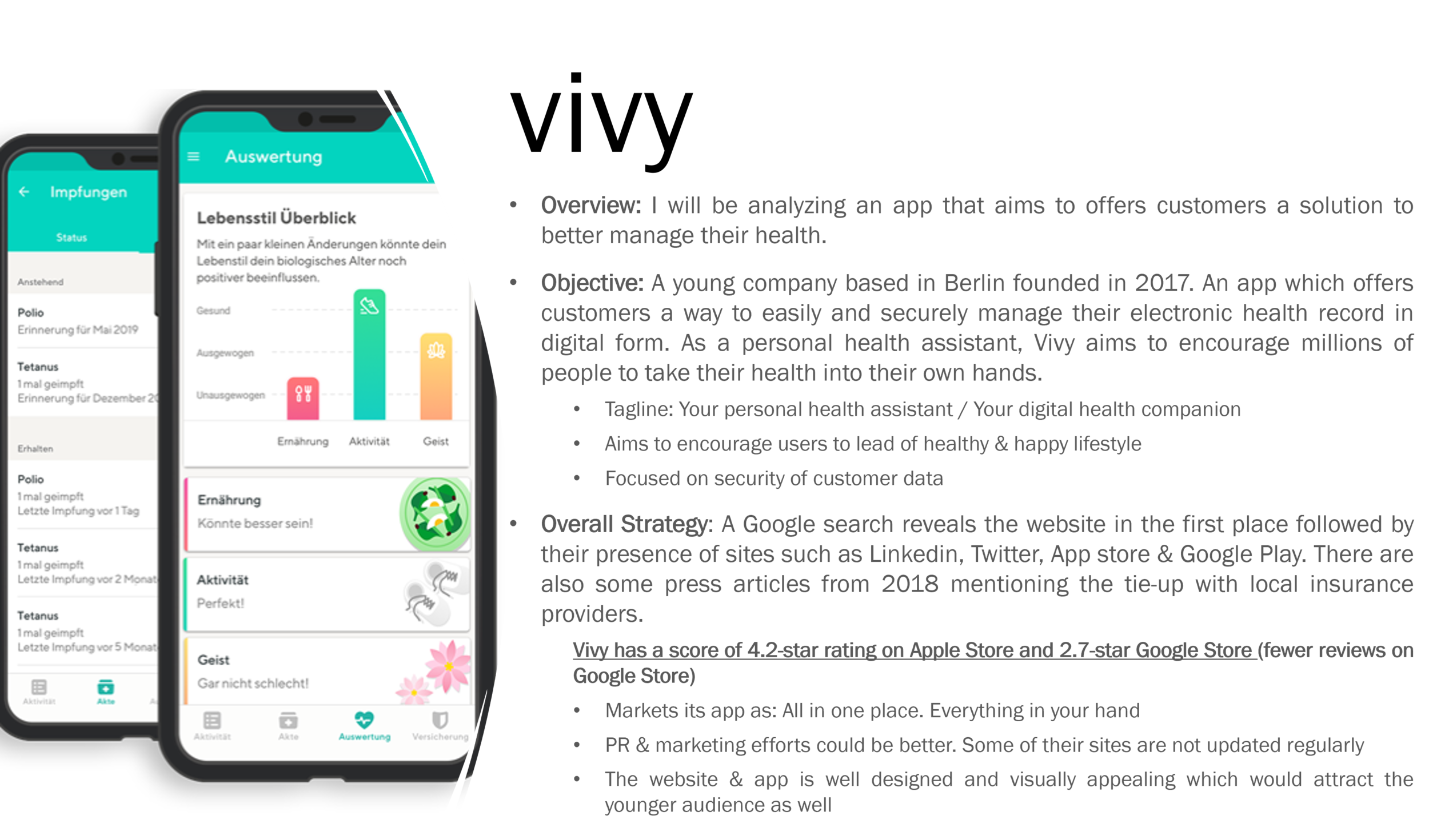
I identified 3 competitor apps with health & fitness as their primary focus. However the app Vivy, came very close to the idea I had envisioned for my product. Vivy is an app founded in 2017 Germany, that gives users control over their health data and allows them to better manage their health.
USER SURVEYS & INTERVIEWS
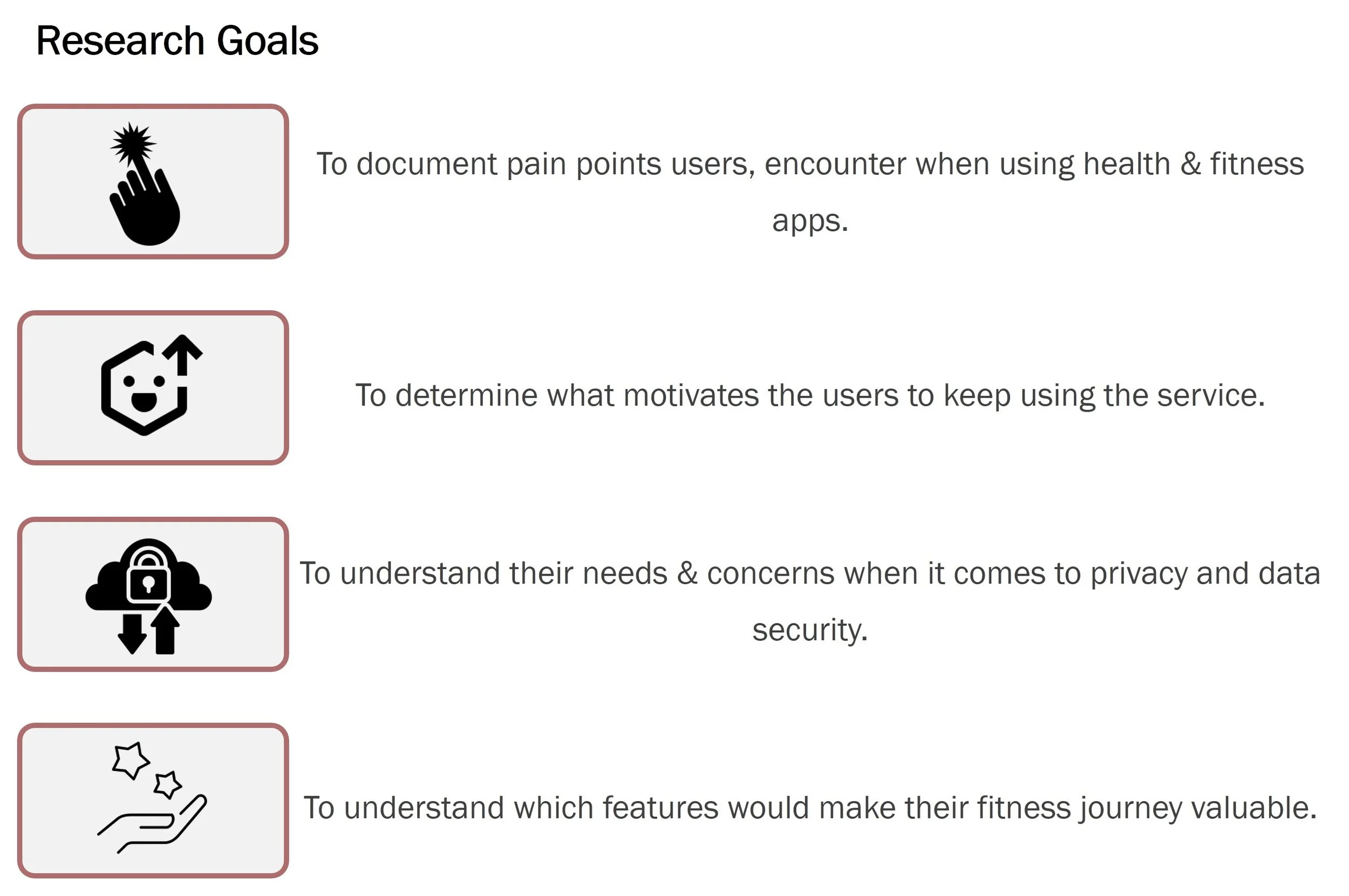
For my product, I used surveys & interviews as a method to gather some insights and observations.
Surveys: Helped me gather user needs & pain points The survey results also helped me identify my target audience, age group and what features or information they would find valuable in a health & fitness app. The survey responses were crucial to draft clear & concise questions for my next step – Interviews.
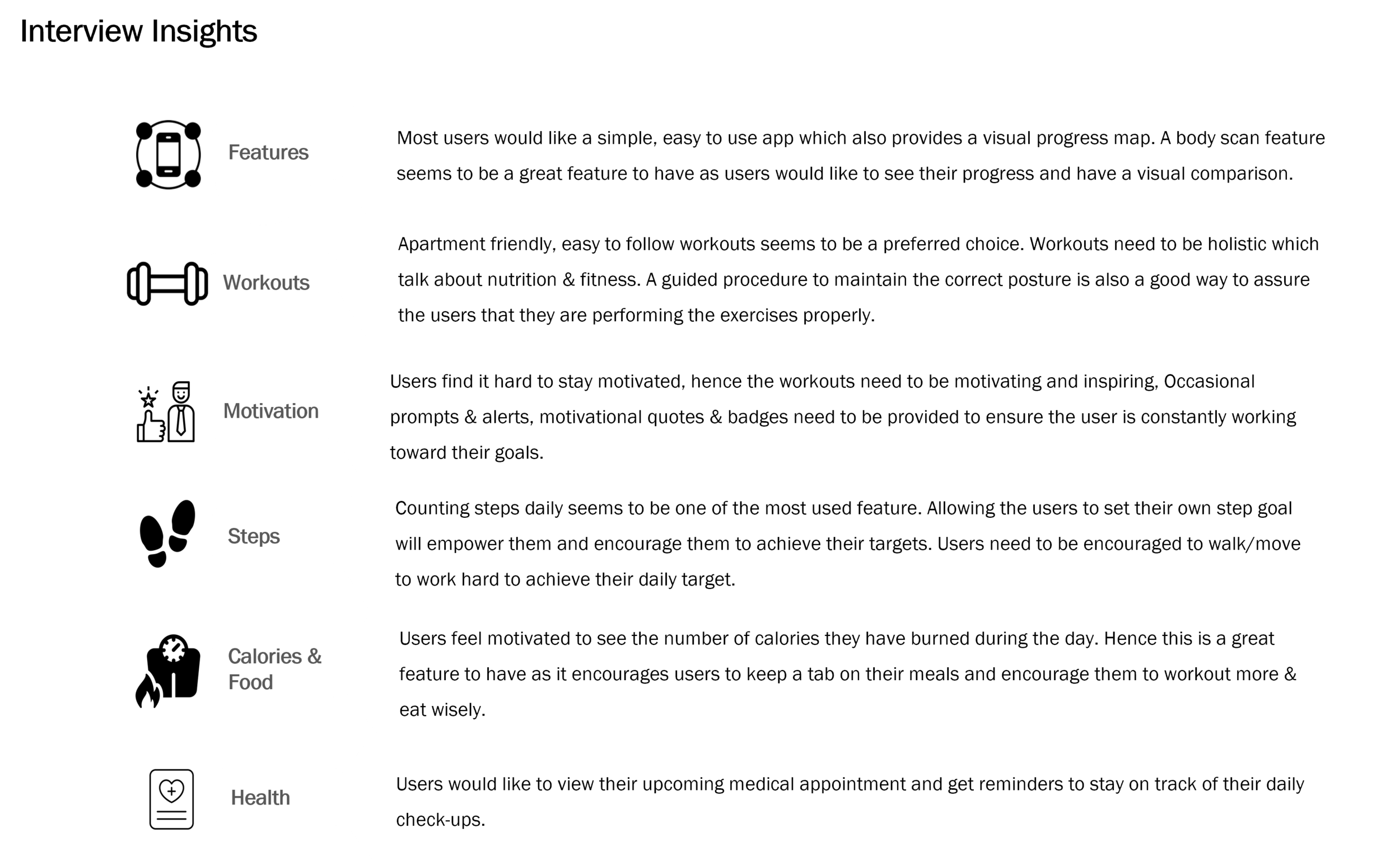
User Interviews: The most powerful tool during my research phase. By conducting interviews, I was able to further expand my understanding of the user needs & frustrations.
During my research process, I interviewed participants from Mumbai,India, Toronto,Canada and Berlin,Germany.
SAMPLE INTERVIEW QUESTIONS
What do you do to stay fit & healthy?
Do you feel frustrated at any time using the app? When & Why?
How do you keep yourself motivated to achieve your health & fitness goals?
What would make you feel secure when using any product/service? (privacy & data security)
Do you like to share your health & fitness achievement on social media? If not, why?
Would you enjoy competition with friends to achieve your weekly goals?
When using the app, how do you feel rewarded?
Is there anything you would love to have in the app that would make your experience memorable or valuable?
Conclusion: The interviews provided me with valuable insights into what methods users adopt when working towards their health & fitness goals and what drives and motivates them. These gatherings from the interviews were crucial to charting out the plan for my product.
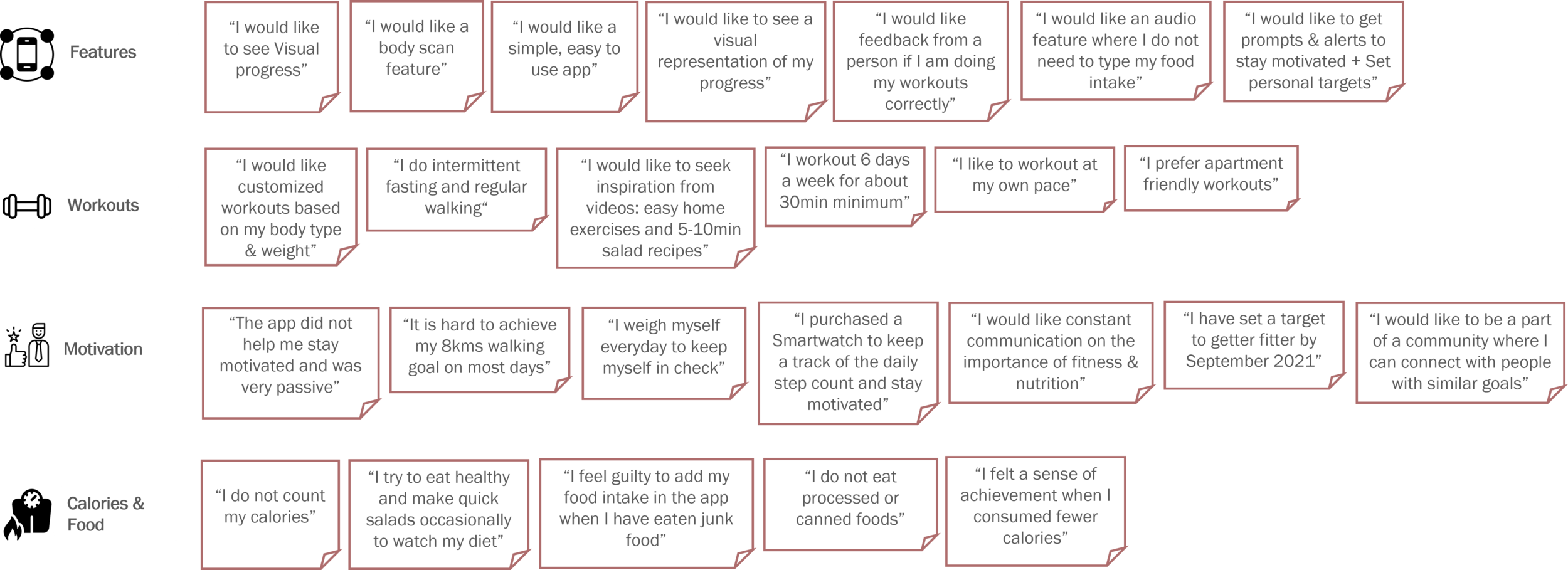
AFFINITY MAPPING
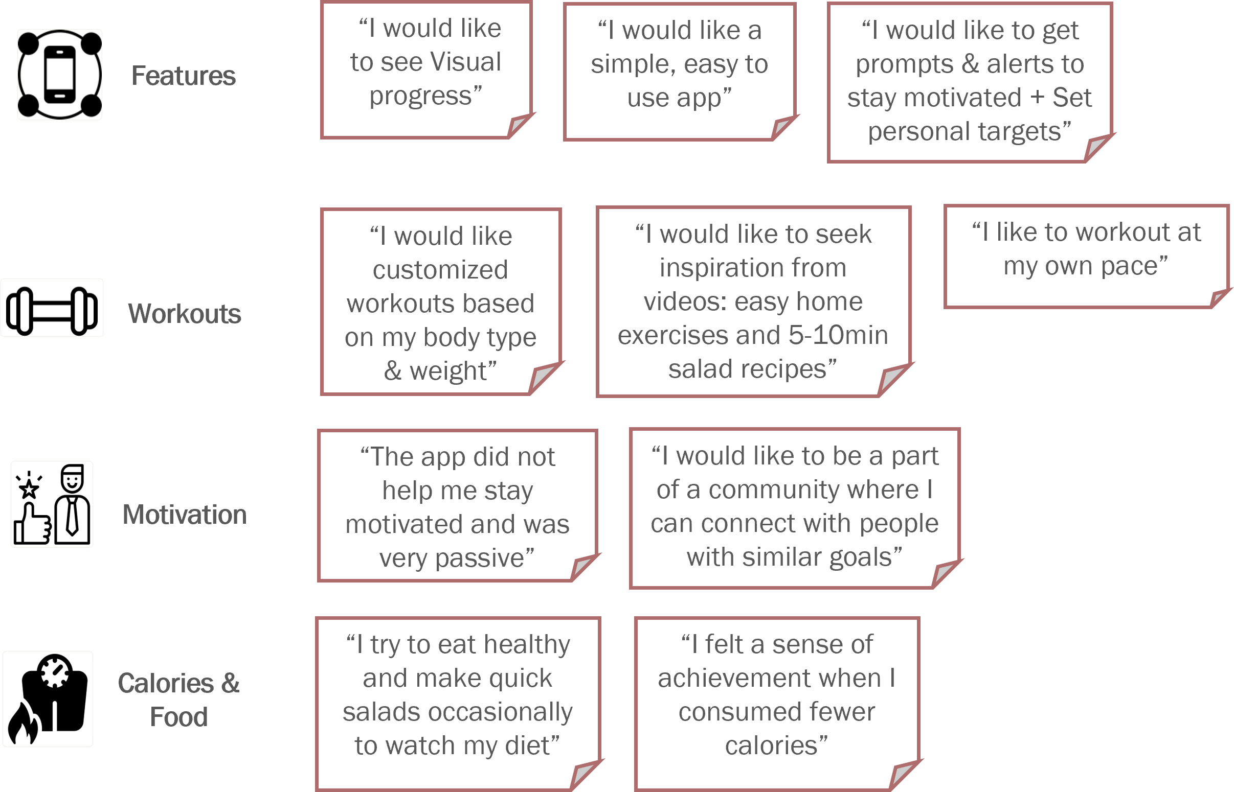
The affinity mapping process helped to better categorize the information based on each user's approach & habits towards their personal health & fitness. These user insights proved to be extremely beneficial to design features that would be valuable.
These bits of information have been grouped to chalk out patterns of behavior or sentiment across multiple participants.
View the Rainbow spreadsheet, click here
KEY FOCUS AREAS
The affinity mapping provided me a clear overview of the features I need to focus on to create a user centered design. For e.g.,
Visual Progress: Offer user a progress chart on their Home screen so they can monitor their progress.
Customized Workouts: A filter option for users to select and customize their preferences.
Eat Healthy: Offer users an option to create Meal Plans to ensure they are in control of their eating habits.
2.DEFINE
The Define phase is one of the most crucial elements of my design process, I spent a considerable amount of time putting together my primary persona and defining user stories.
By creating personas and defining their user stories, I could stay on track to design for the user, without losing sight. It also helped me develop a connection and empathize with the person I am designing for.
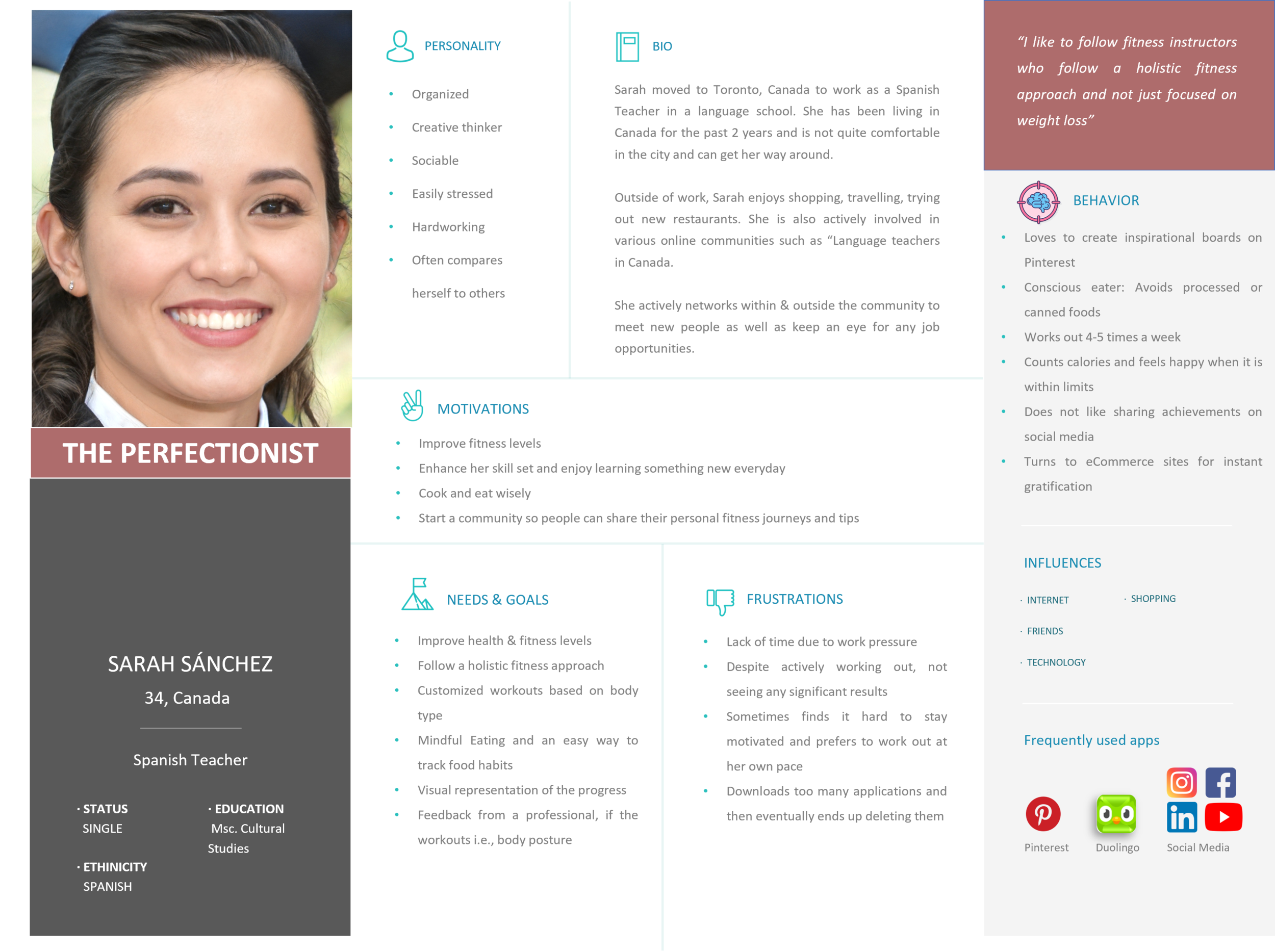
USER PERSONAS
I focused on creating two primary personas for my project, encapsulating their users' needs, frustrations, behaviors and goals. The personas also worked as a guiding tool as I started to dive deeper into creating my product. Both the personas have different needs and behaviors which helps broadens my perspective when designing a product that will be suited to a diverse audience.
RESEARCH FINDINGS
The user research findings were categorized into Behaviors/Attitudes, Needs/Goals and Frustrations. The process of sorting information was quite therapeutic and also provided me with a deeper understanding of the user and how their regular day looks like. This phase is a good time to identify design opportunities and bring to light problems that the users face.
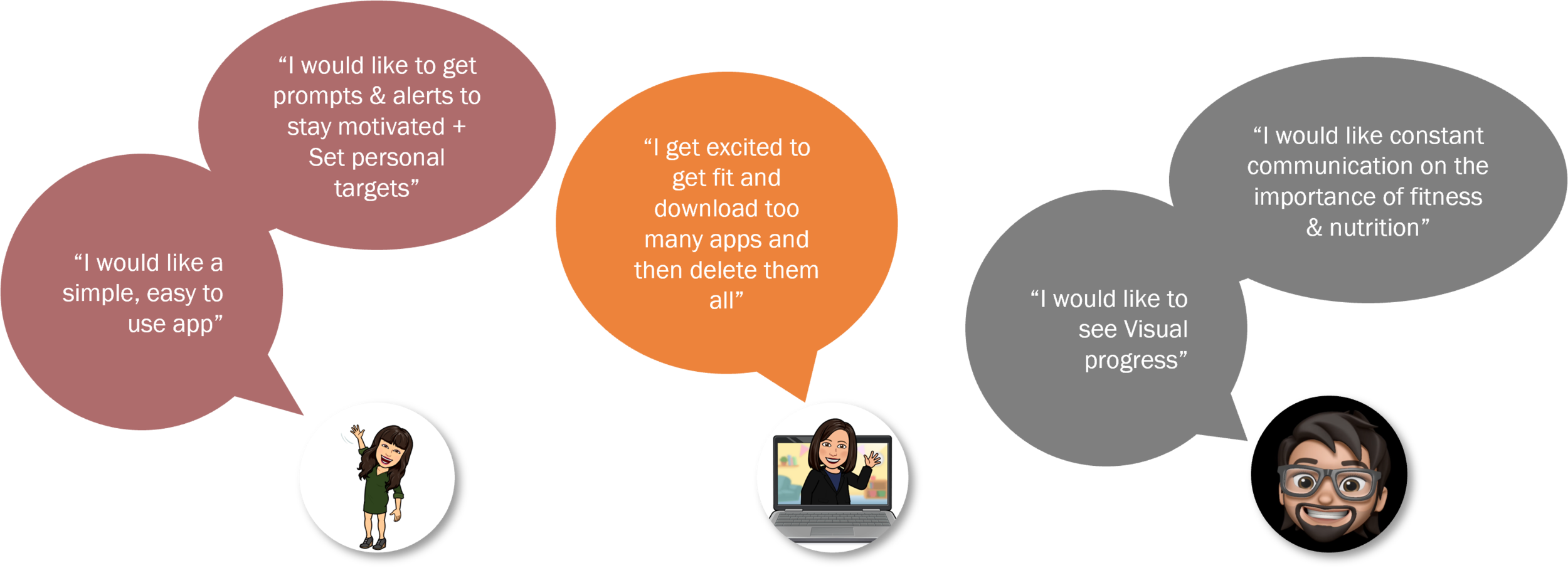
USER STORIES & QUOTES
Based on my findings, I could now form simple yet effective user stories which were well-defined and clearly communicated the users needs. These user stories will further help in creating a viable product.
Key Participant Quotes
These key quotes ensured I stayed on track to design a product that is in alignment with my user needs.
3.IDEATE
The Ideate phase is where I was challenged to use my extensive research & findings to chart out the user journey, task flows and develop the sitemap. It also made me think about what kind of emotions my users will encounter when they interact with my product. Identifying these touch points was crucial to build a smooth, intuitive and functional product.
USER JOURNEY
Two user journey maps were created for each of my persona with unique scenarios. These maps provided me a good insight into how the user travels through my product and what touchpoints within the product will create delight / confusion.
By creating a detailed map, it also helped me identify the different screens I need to develop for my product.
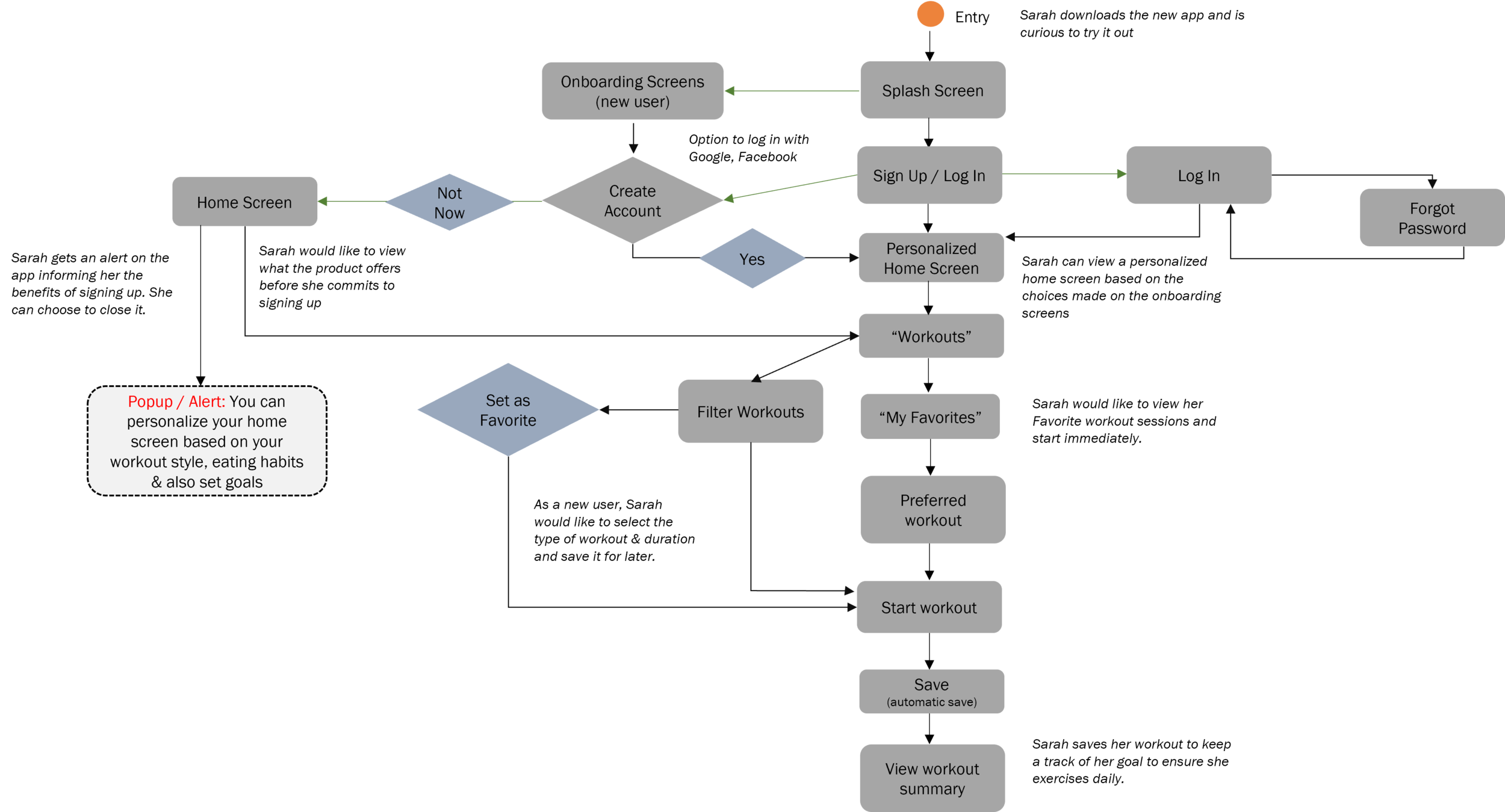
USER / TASK FLOW
After identifying the user journey, I could now create the detailed user flow for each scenario.
As the design kept progressing, the user flows did see numerous iterations to ensure that no important touch point is missed out. In my initial draft, I had missed out on adding the user entry through the onboarding screens which is reflected in the current version.
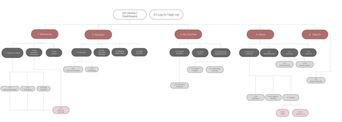
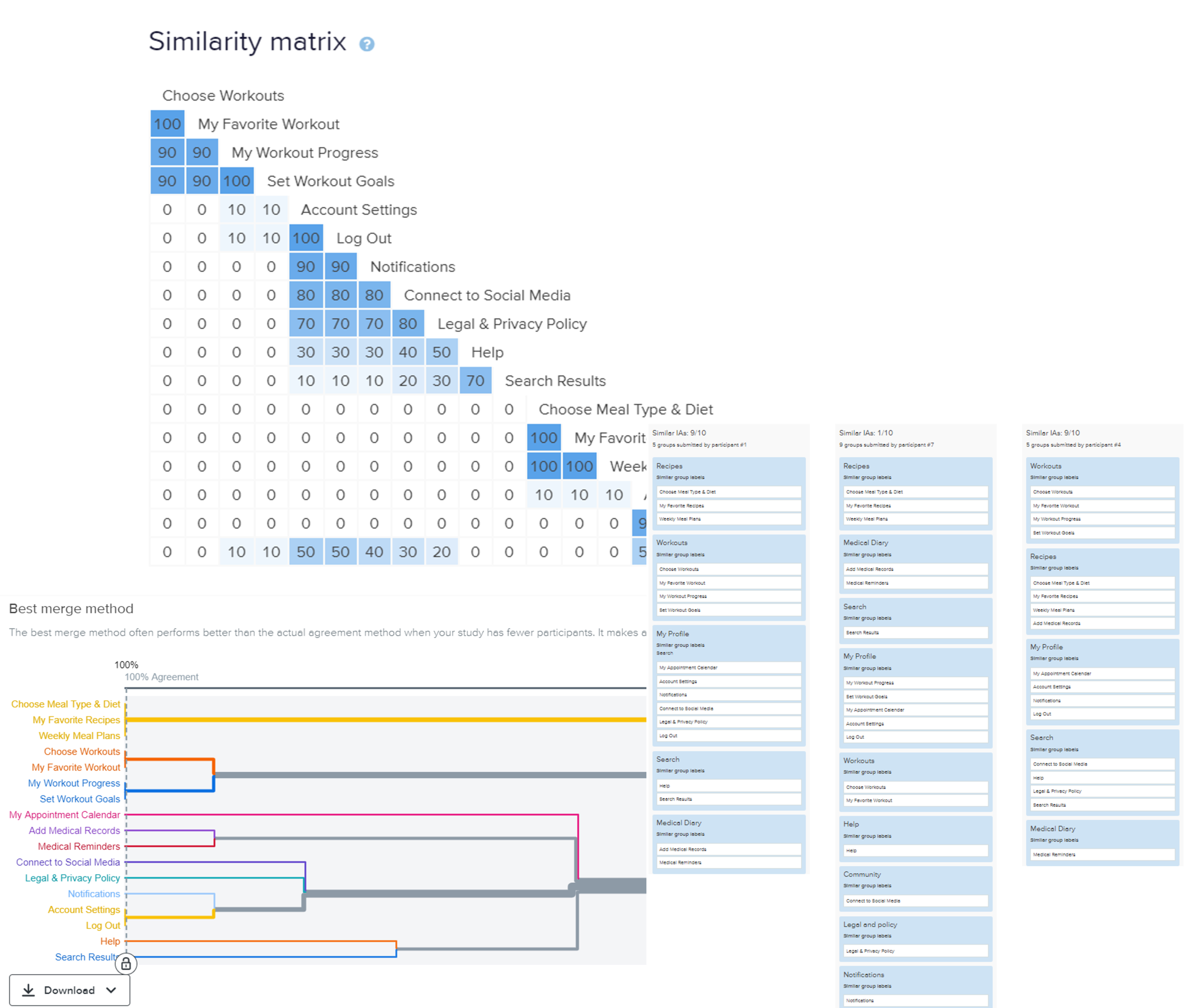
SITEMAP & CARD SORTING
After having identified the user entry & touchpoints for my product, it was time to draw up a sitemap to offer a big picture view of all the elements that are crucial to my product.
I was quite pleased with result to know that in my card sorting exercise most of my given labels were sorted intuitively by the user. However, I did notice that My Journal, Search, Help, Connect to Social Media and Legal Policy did cause some confusion and a few users found it hard to categorize this information.
WIREFRAMES
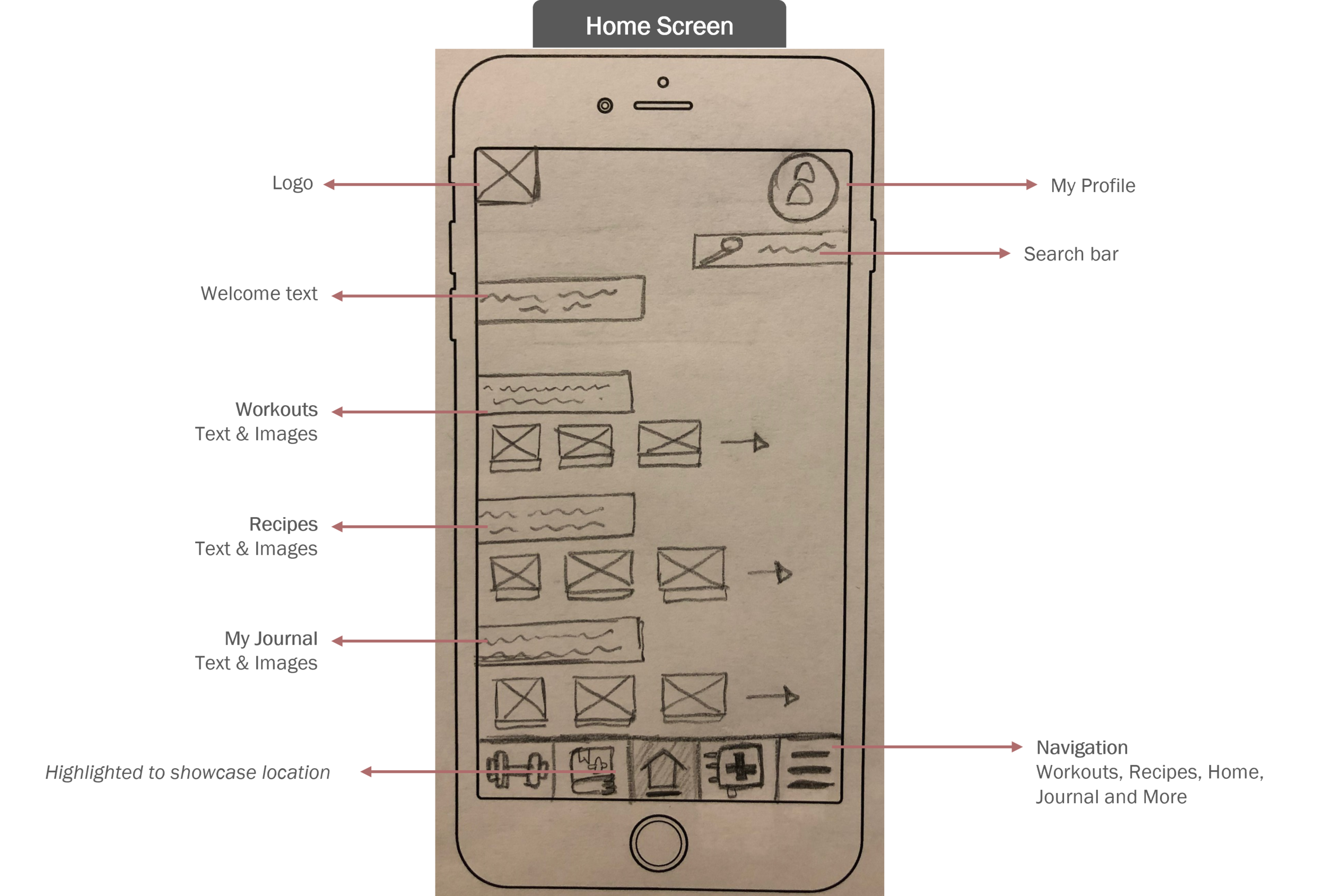
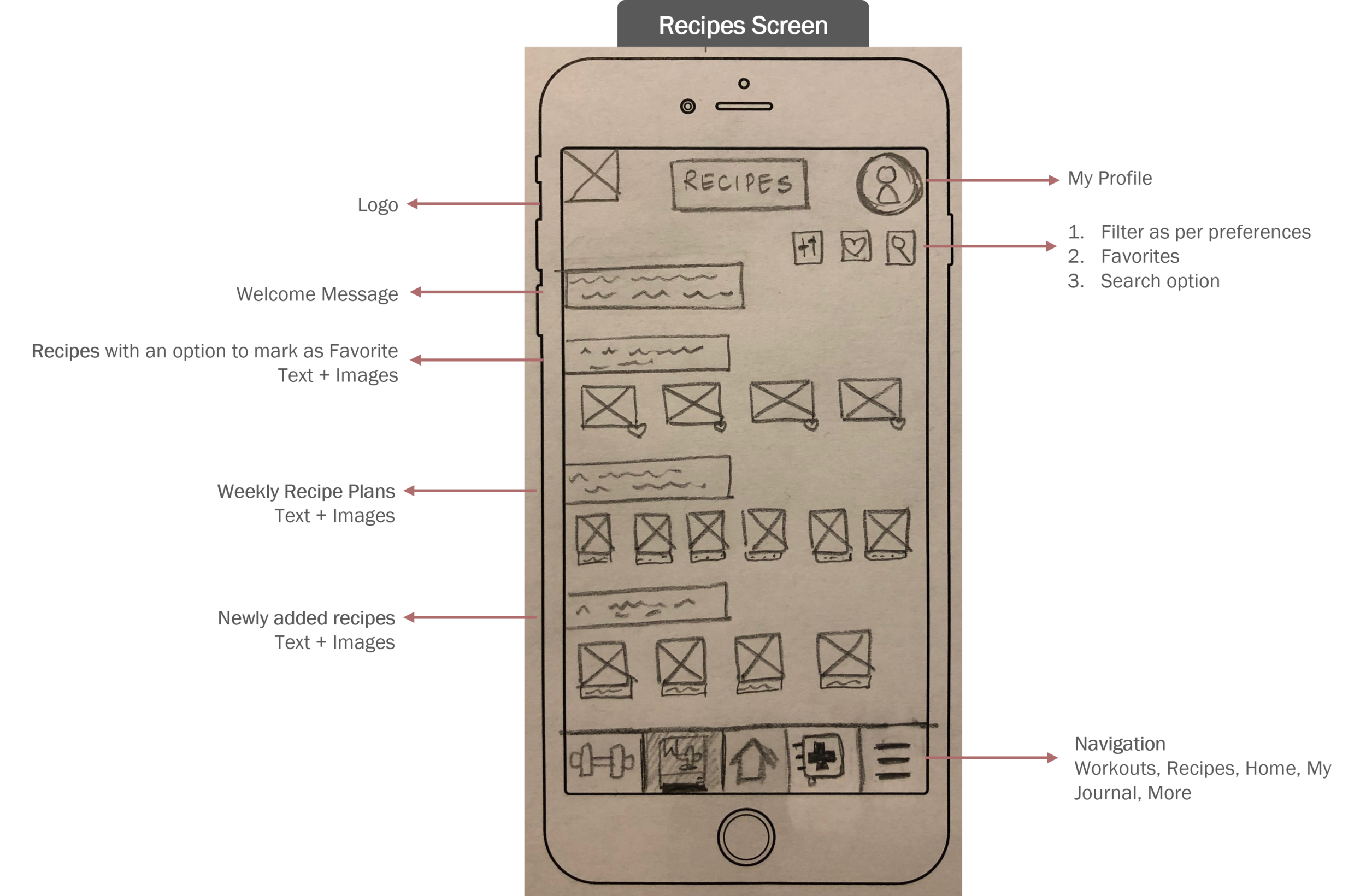
During the Ideate phase, I also started sketching out my initial design ideas on paper. As the design progresses, I ensured that I designed my screens keeping the grid alignment (4 column) in mind. For the Olive app, I have chosen the Carousel style to highlight content. This format presents clear information and the images provide the user a quick glimpse into the content or what to expect.
LOW - MID - HIGH FIDELITY WIREFRAMES
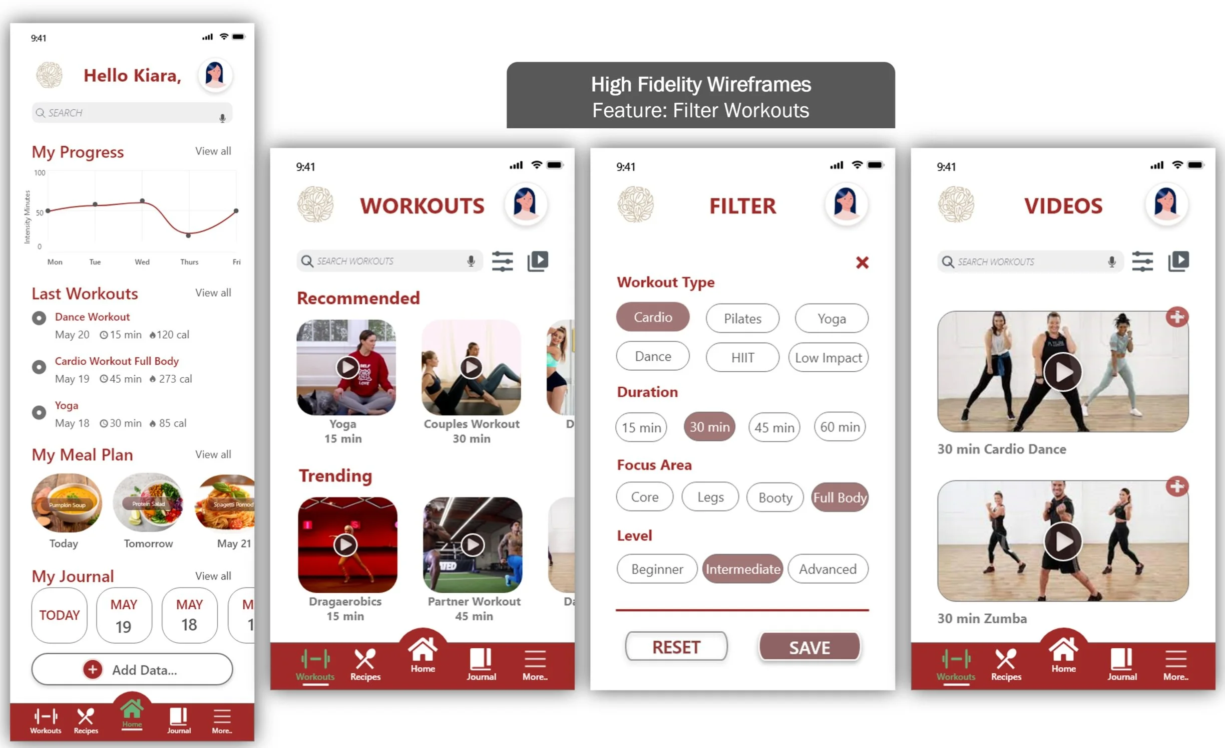
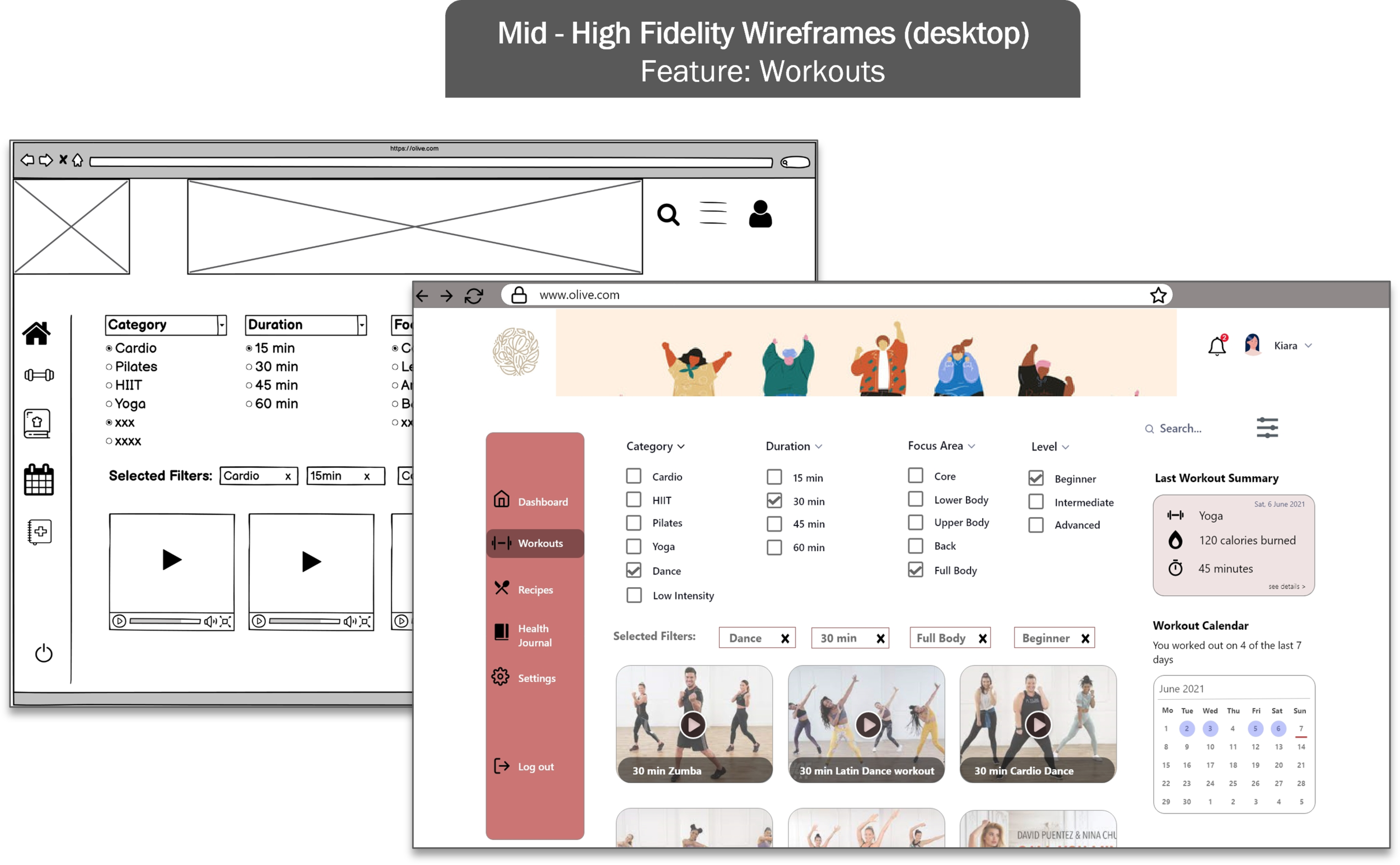
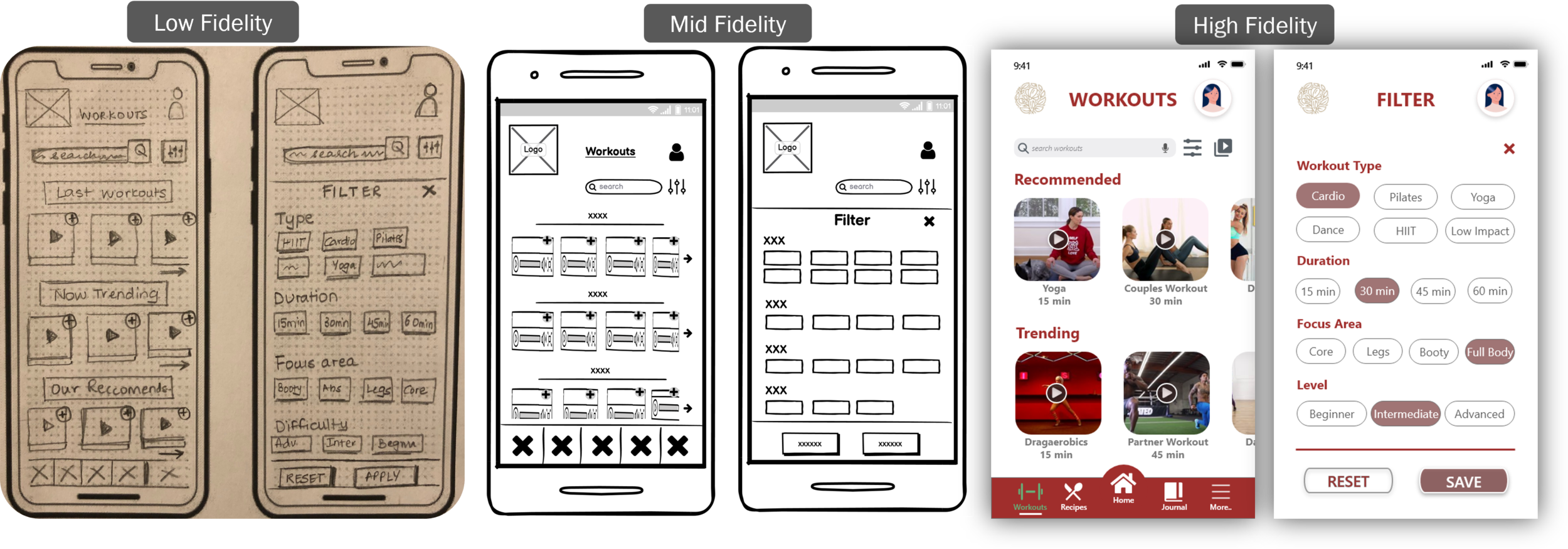
Below is a capture of the Low - High Fidelity progression for one my features - Filtering Workouts based on Workout Type, Duration, Focus Area and Level.
The high fidelity frames are still not the final frames as there were still more learnings to be gathered from the usability testing.
4.PROTOTYPE
The Prototype Phase - For me, it was the most exciting phase in the design process. Seeing all elements coming together slowly was certainly an unmistakable happy feeling . For my design, I worked with Adobe XD.
The previous phases were all about research, defining personas, user journeys amongst other stuff, however during the prototyping process, I felt most energetic as I could finally test my creativity, think out of the box and see my design finally coming together.
During the research phase, the users mentioned that would prefer to use the product mainly on their mobile phones as it is comfortable and also easier to keep a track of their daily progress.
As one of our main goals during the project was to create a web based product, I explored creating a few designs for desktop as well, even though my main focus was for mobile. Having the opportunity to explore some Desktop screens was a good learning experience to work with more real estate space.
RAPID PROTOTYPING
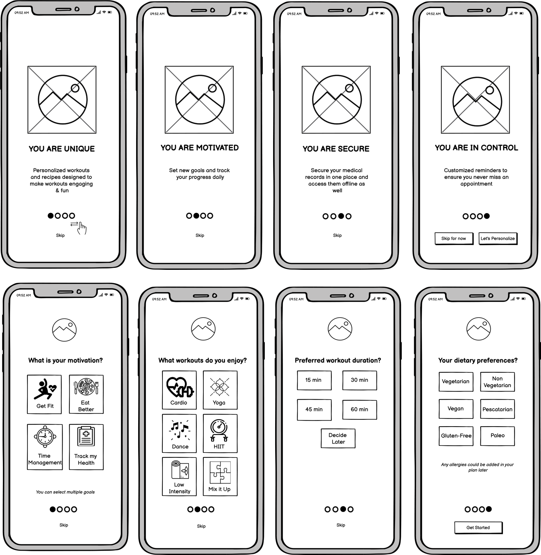
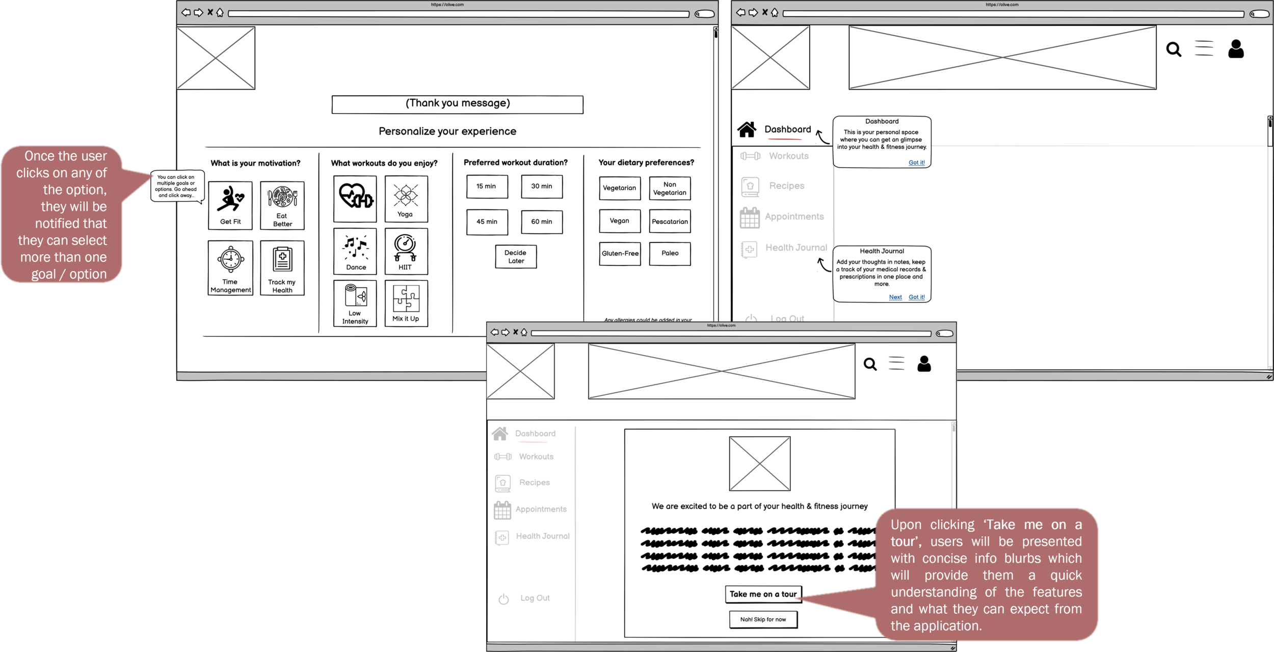
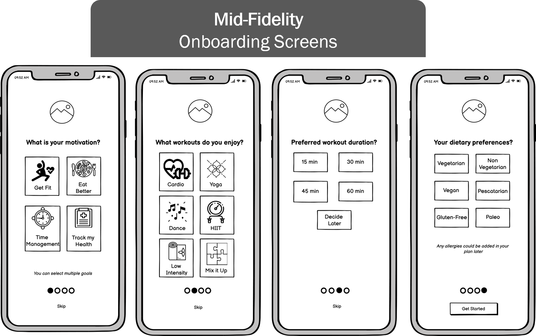
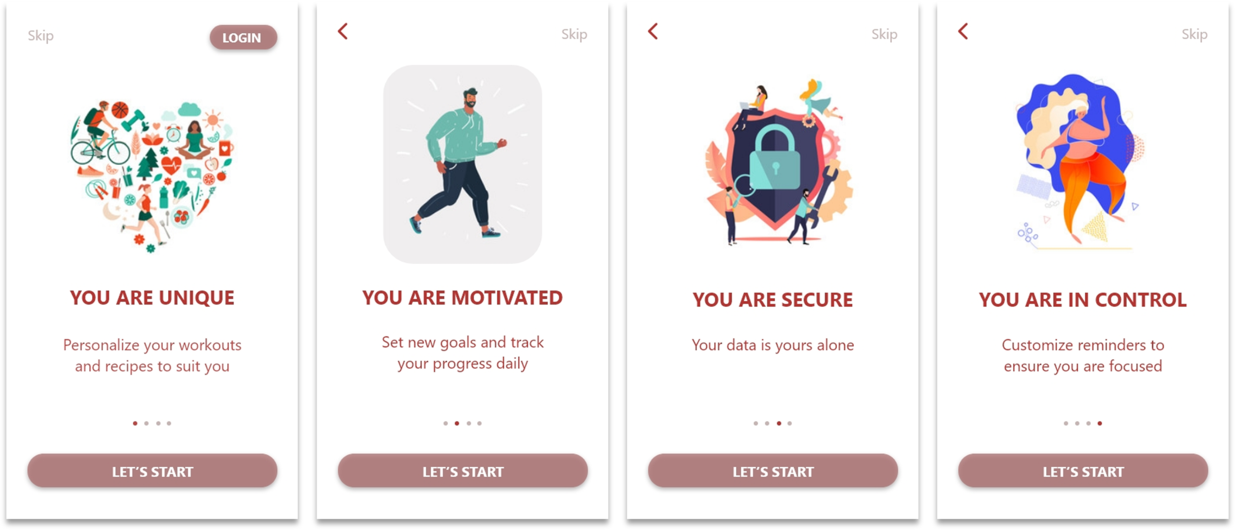
Rapid Prototyping for the user onboarding screens for mobile & desktop. As I have come to realize that I do enjoy creating wireframes, this was a good learning to understand the dynamics for creating a product for desktop vs mobile, within a limited time frame. This also enables designers to adapt to working in faster environments and learning the art of presenting ideas efficiently and quickly.
Rapid Prototyping: Onboarding screens for mobile
Rapid Prototyping: Onboarding screens for desktop
PROTOTYPING PHASE
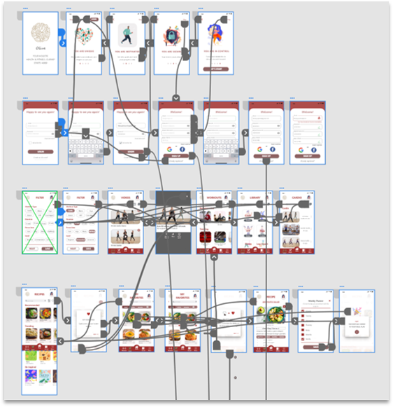
Linking it all together! Looks messy but it works...
Making sure that each element is connected to ensure the user does not feel lost at any point. Before finalizing my prototype, I spent a considerable amount of time trying it out myself.
5.TEST & EVALUATE
Reaching the final phase of my course project did feel like an accomplishment, however I was well aware that it was not the end. It was only a start to constantly improve and create a viable product.
During my entire course project, we encountered instances that taught us that 'Design is an Iterative process'. However these multiple iterations have improved my skills as a Designer, polished my design and pushed me to constantly focused on developing a user centered product.
USABILITY TESTING
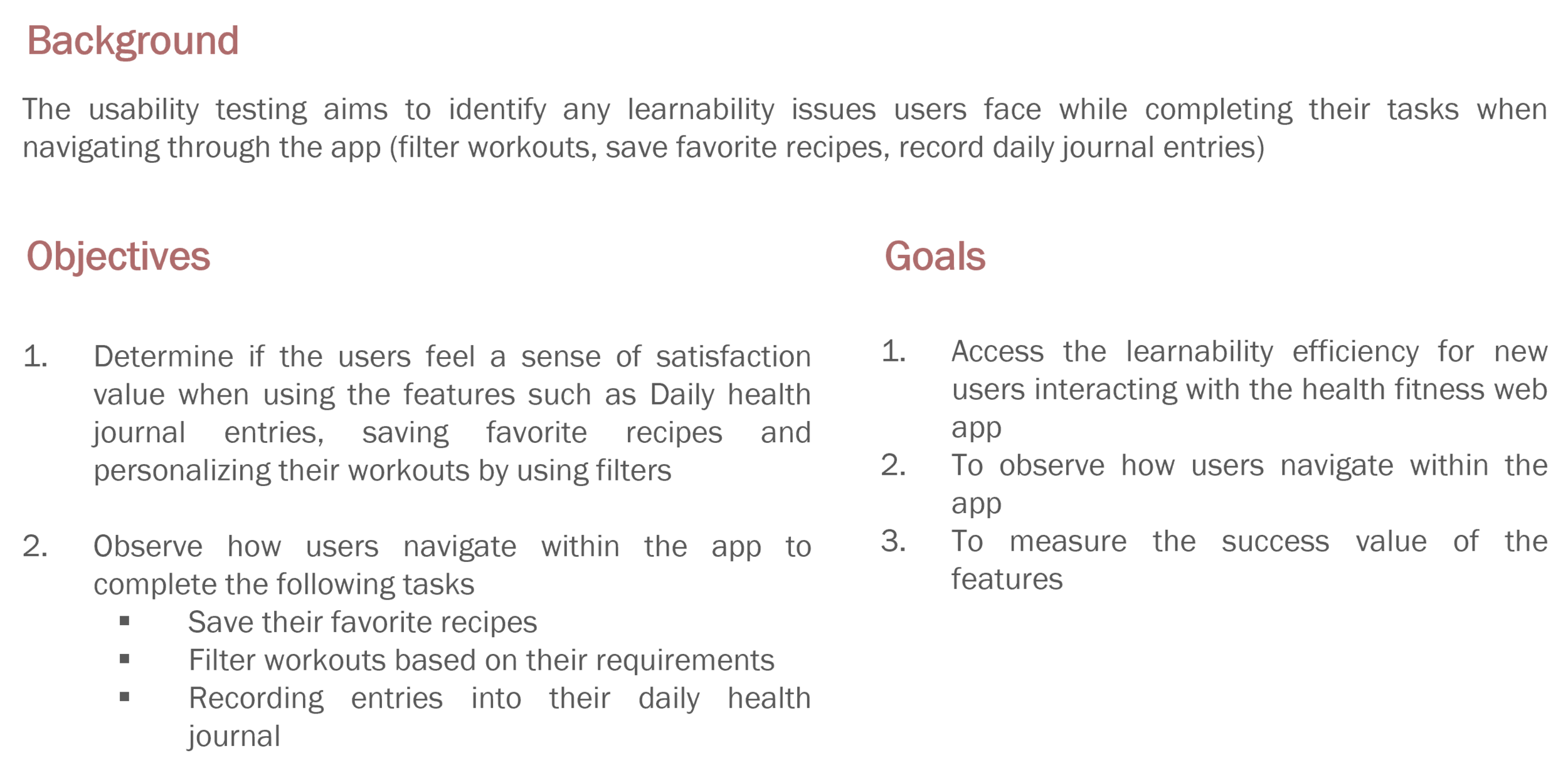
Started off by creating a plan and identifying the people I would like to interview, give them a sneak peek into the product and gather valuable feedback to better my product.
USER INTERVIEW DETAILS
Locations: Berlin (Germany), Mumbai (India), California (USA)
Method: Remote Moderated Tests
Timeline: 17th and 18th May 2021
Duration: 20 - 30min
Tools used: Laptop, Book & Pen for taking notes, iPad
Recording Tools: Zoom and iPad for saving audio files.
USER SCENARIOS
During this phase, I spent some time thinking of various scenarios to better align with my users motivations and develop a product well suited to their needs.
Out of 10 scenarios that I created, I picked 3 key ones for my usability testing that focused on the key tasks in my product.
FINDINGS & AFFINITY MAPPING
Post the usability testing, I gathered the findings to categorize observations and identified errors that the users faced when interacting with my product.
FINDINGS
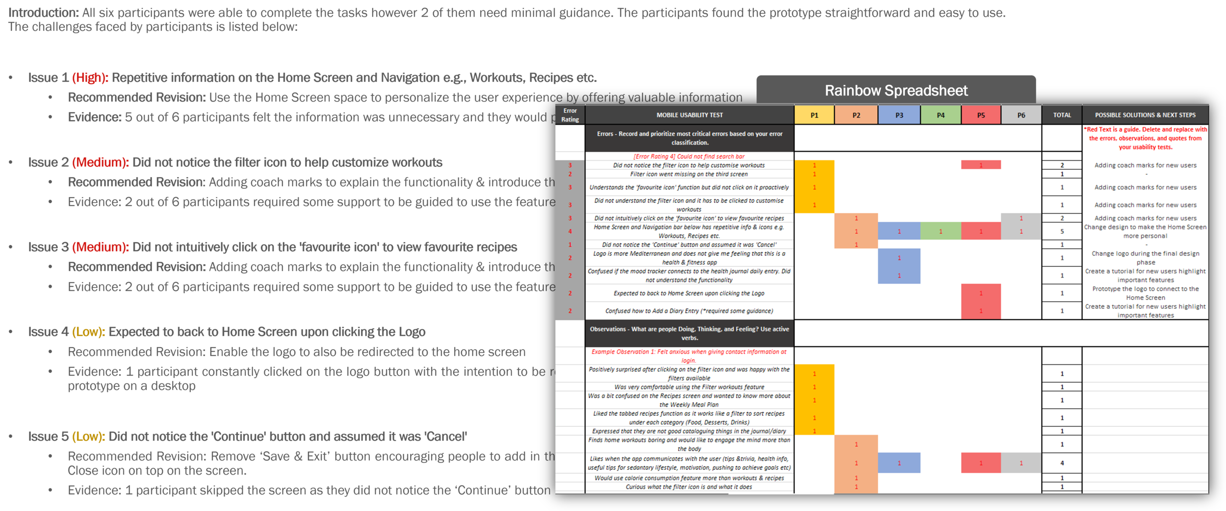
Collating feedback and using the rainbow spreadsheet to identify & categorize errors helped me prioritize my tasks & focus on what needs to be fixed immediately.
USER QUOTES
A snapshot of the positives & negatives gave me a clear idea what the users are looking for and what needs more improvement / reconsideration.
Below are a few identified errors and observations along side with potential solutions.
ERROR: Repetation
Identified Error: One of the critical errors I noticed is that many of my participants found the information on the Home, Workout and Recipe screen repetitive. They expressed that they would have liked the Home Screen to be more personalized.
Solution: I designed a Home Screen that is more personal and offers an overview of the users activity within the app.
OBSERVATION: Tailored Onboarding Experience
Key Observation: Some users expressed a desire to tailor their onboarding experience before they sign in, by adding their workout & health preferences.
Solution: Created a few screens that allow the user to select preferences before they create an account. After which, their home screen will be tailored & adapted to the selections made.
LEARNING: The usability testing helped me discover critical elements that seem minor at first glance but are key to creating a valuable product & increase user engagement. By implementing the solutions right after the testing, I could personally see the difference it made to my product not just visually but also added to the functionality.
CHANGING PATHS
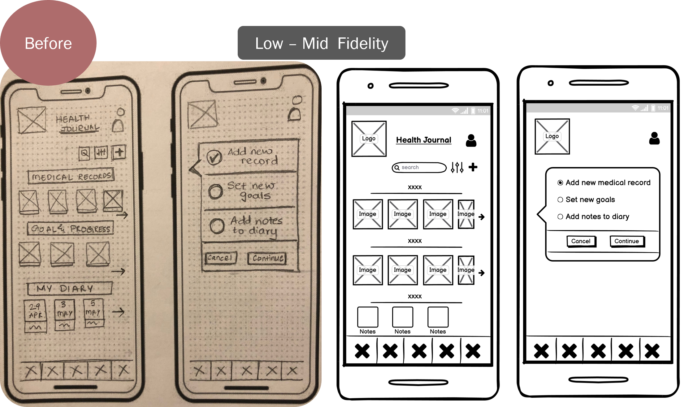
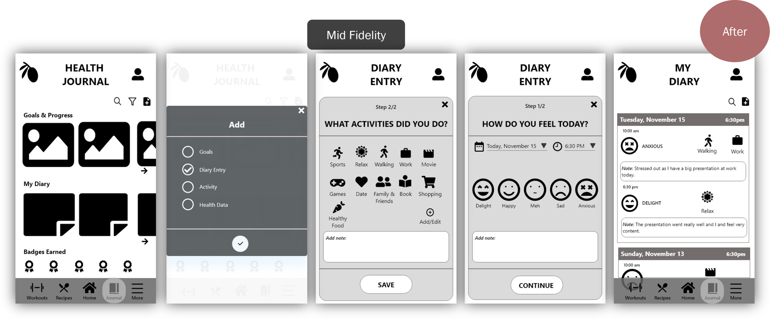
Another key finding during my usability testing was the Medical Journal feature. Below is a snapshot highlighting the idea, learnings and design iterations.
This experience taught me be to be flexible when it comes to steering paths and actively listening to user needs and observing how they are engaging with the product.
Here is a quick look at the transition from Medical Journal to My Health Journal....
PREFERENCE TESTING
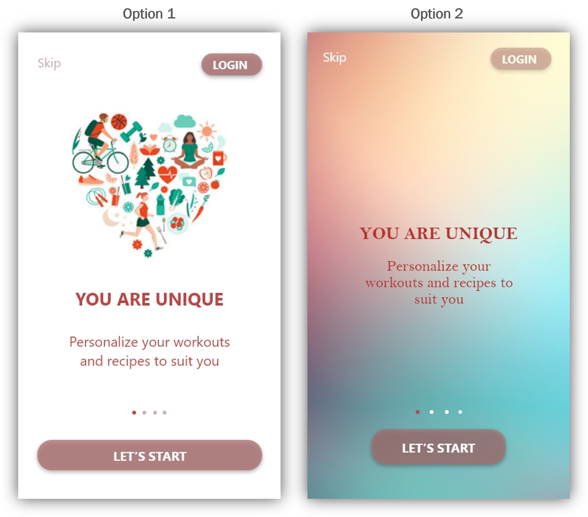
As I now move onto creating a visually stimulating experience for my users, I decided to try Usability Hub to run a preference test to understand what style of visuals connects better with my audience.
METHOD
Title: Preference Testing _ Olive Health & Fitness App
Design: Onboarding Screens
Participants: 12
Platform: Usability Hub
Purpose: To test which design people prefer visually and emotionally (font, visuals, buttons and layout)
RESULT
Option 1 garnered favorable response due to the visuals, as it connects with people more than Option 2 which was more abstract.
My designs aims to build on illustrations to ensure consistency and strike an emotional & personal connect with the people using my product. A key take-away was that illustrations seem to have an immediate connect with people and building on this design will certainly appeal to my target audience.
FEEDBACK FROM PARTICIPANTS
DESIGN ITERATIONS
Onboarding Screens
Based on the participant feedback, I was confident to adopt Flat Style Illustrations for my product & the onboarding screens as well.
REFINING THE DESIGN
Design is a whole lot of things apart from just visuals, in this phase, I go one step further to give the product a uniform look and feel.
This process helped me get a brief understanding into Visual Design, UX Writing, UI and Team Collaboration which is certainly a must have for any Designer. By collaborating with my friends, colleagues helped me strengthen my design decisions and improve on designs as well.
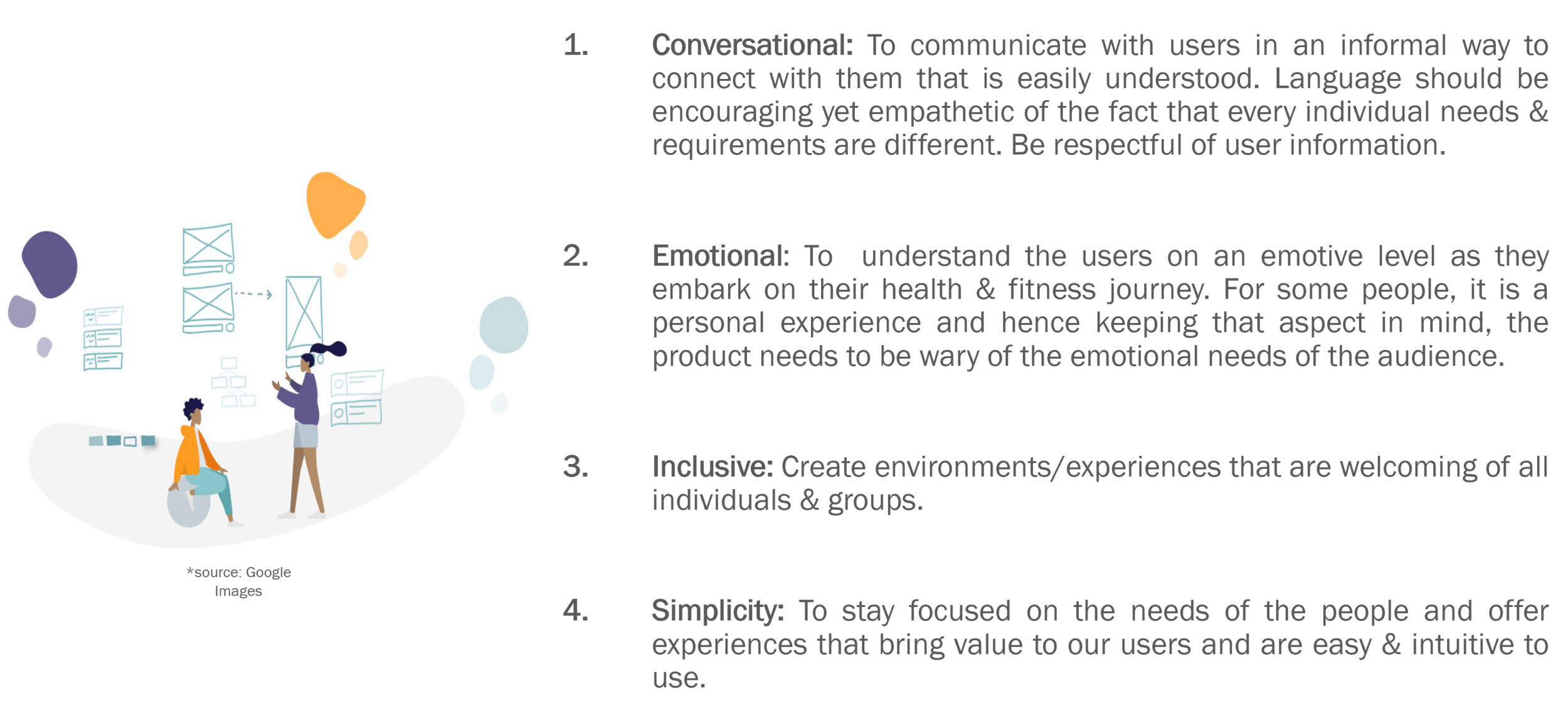
DESIGN PRINCIPLES
Chalking out the design principles and style of communication that I would like my product to highlight.
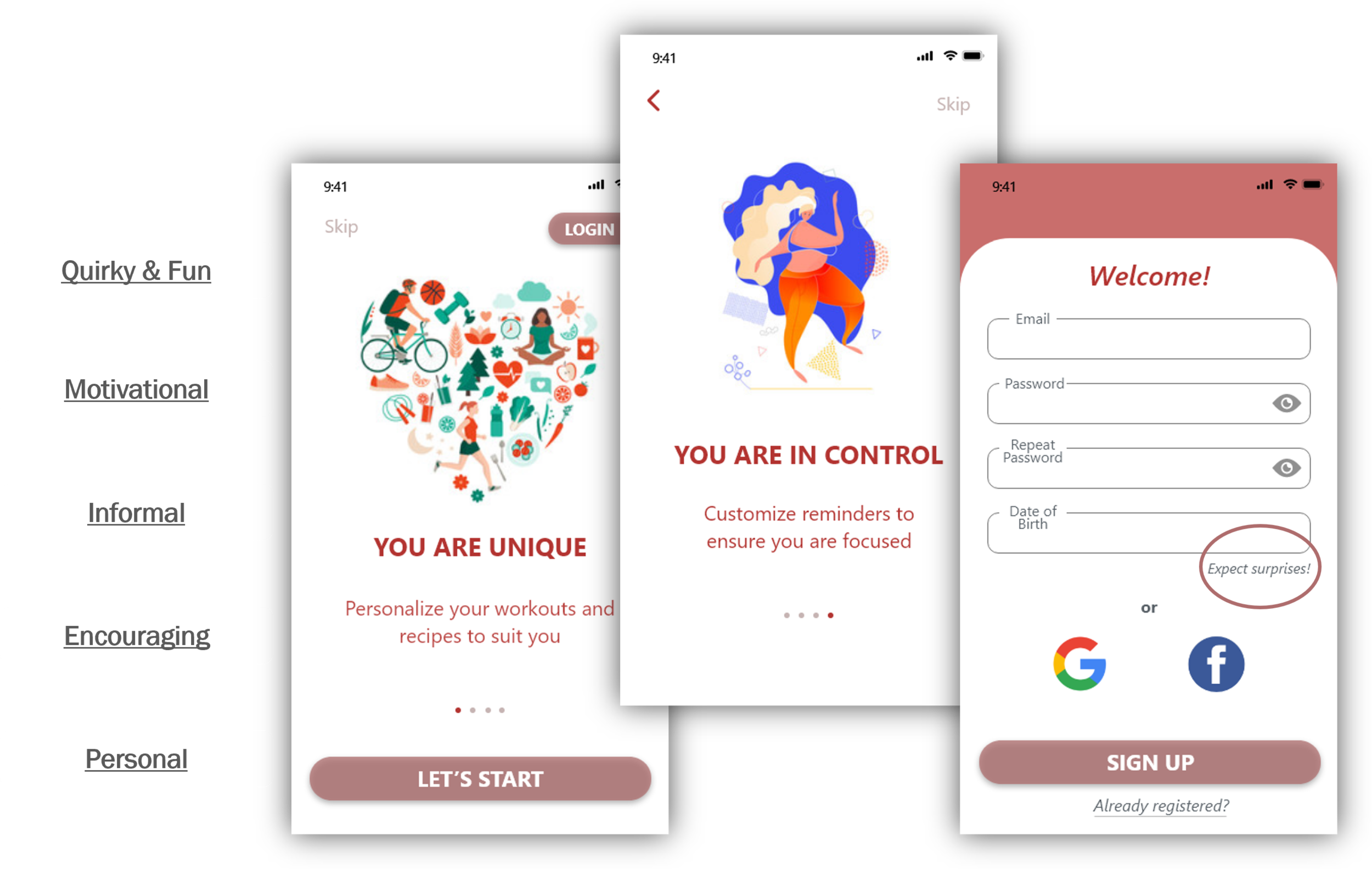
LANGUAGE & TONE OF VOICE
The copy is kept simple & informal so that the audience can immediately connect. An underlying quirky tone of voice is also essential to add a humorous element to the product, making it fun to use.
As the product, aims to help individuals focus on their health & fitness goals, it is important the tone needs to be motivational yet impactful in order to encourage users to achieve their goals.
EMOTIONAL DESIGN
Here are a few experiences that I aim to design for my users to encourage emotional engagement with my product.
As health & fitness is a personal journey for many, it is my goal to reward users for their efforts and also offer them a product that is fun and easy to use daily.
STYLE GUIDE
A clean design with minimal use of colors. The color palette consists of subtle tones red & pink as the main colors.
Red: to invoke passion, excitement and urgency to start focusing on health & fitness.
Pink: to balance out the powerful red and keep it fun, creative and easy.
Grey/White: to keep the design neutral & timeless.
Green: is associated with a positive outcome. It also helps users feel relaxed and calm.
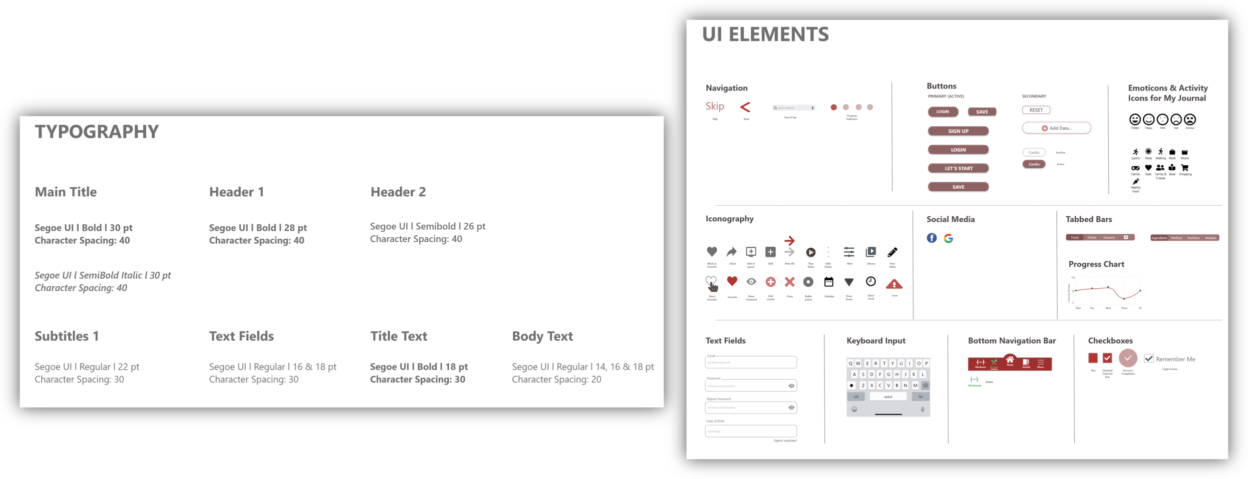
TYPOGRAPHY & UI ELEMENTS
Segoe UI (user interface) is a sans-serif font.
The font intends to improve the consistency in how users see all text across all languages.
VISUALS
Why I chose Flat Illustrations?
Popular & trendy
Inclusive & Diverse
Focuses more on usability, and less on familiarity
Easier to adjust to multiple screen sizes
DESIGN COLLABORATION & PEER FEEDBACK
After putting my thoughts together on the Design Style Principles & Style Guide, it was an important step to collate feedback from my peers to understand how they perceive the design.
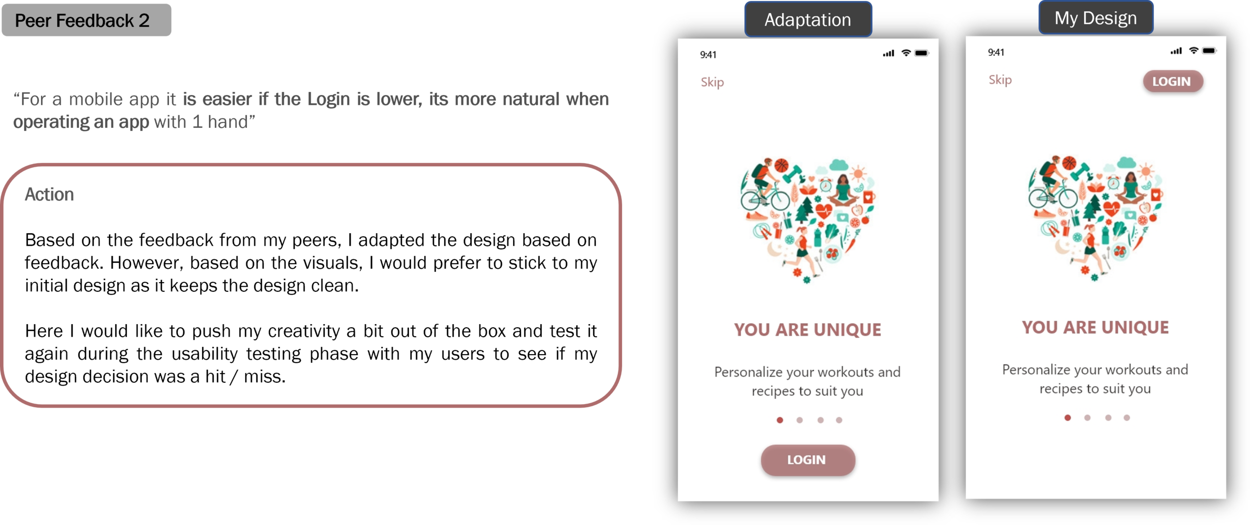
This process provided me with some good feedback after which I reviewed and adapted my designs accordingly. However there were some design decisions I stuck onto despite contradictory opinions from my peers. In some instances I find it necessary to stand your ground and defend some design decisions rather than change everything based on feedback. The slight risk helped me think out of the box and kept me motivated to keep innovating *see peer feedback 2.
Final..yet not so Final Design
Just like the Lochness Monster, there is no such thing as Final Design. However, maybe the Lochness monster does exist!
In my design process, I still have not reached a 100% satisfaction level. I am constantly sharing and gathering feedback and keep asking myself daily ‘How can I make this better’?
Apart from the feedback from my tutor, mentor & peers which I have successfully implemented, I have a few peeve points that I want to focus on improving:
Redesign the Bottom Navigation Bar
Progress Chart on the Home Screen *explained below
Create Inclusive experiences for my users to appeal to a larger audience *in progress
Mood Tracker: Since a few users were not particularly interested by this feature, I would like to ponder a bit more on how I can make this more engaging / maybe reconsider it entirely whether it is adds value to my users.
DESIGN ITERATIONS
Based on inputs & feedback received from User Testing, I have adapted my designs to be more focused on user needs, accessible for people with visual impairments, offer a clean design, minimal content and embrace the white space.
Asset: Home Screen
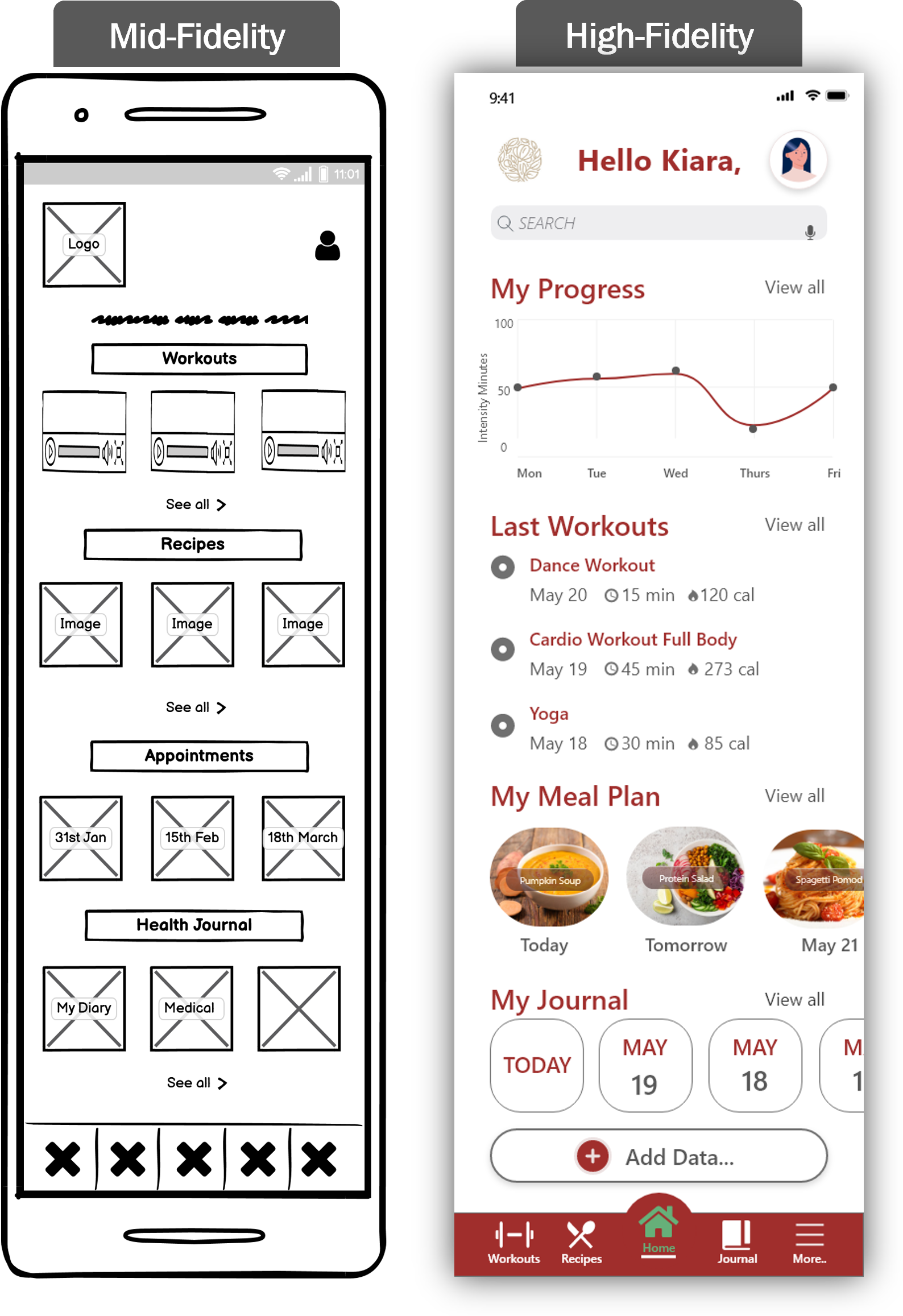
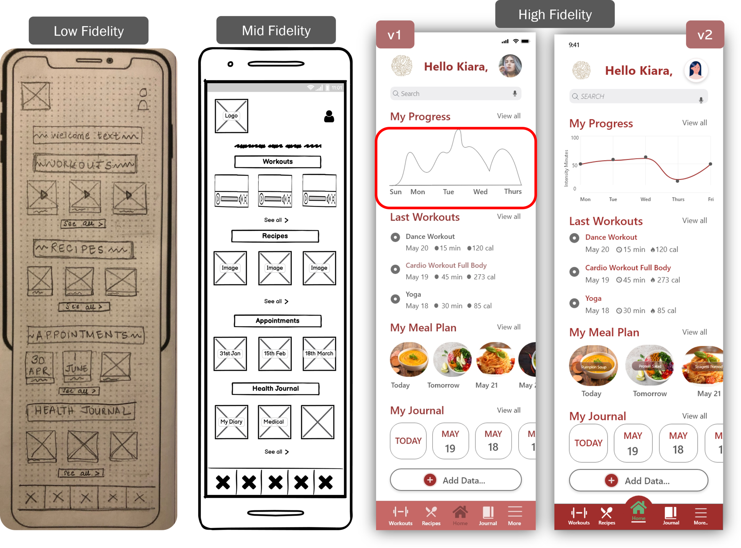
The home screen is the user's door / entrance into your product. This screen has seen many iterations to ensure it aligns with the user needs.
User Testing
Users mentioned that they would like to see their progress on the Home screen. Home Screen should have personalized information and not display repetitive information from the Recipes/Workouts/Health Journal screen.
Improvements
Personalized information specific to user activity
Larger icons and concise text
Progress mapping (the map was revised as v1 did not provide clarity on how to read & understand the chart)
Asset: Recipes
The Recipes screen aims to offer users customized recipes based on their dietary preferences, weekly meal planner & recommendations and trending recipes.
User Testing
Users liked the Weekly Meal Planning feature and the option to favorite recipes. Recommended to include recipes that are beginner friendly + Include nutritional info chart to track calories.
Improvements
Larger icons
Addition of some articles to read as a form of inspiration – this will also be a welcoming break from only viewing recipes & food images
Asset: Workouts
The Workouts screen aims to offer users a variety of workouts which are suited to their current mood / fitness level.
User Testing
Users would like to filter their workouts based on duration, activity type and focus areas.
Improvements
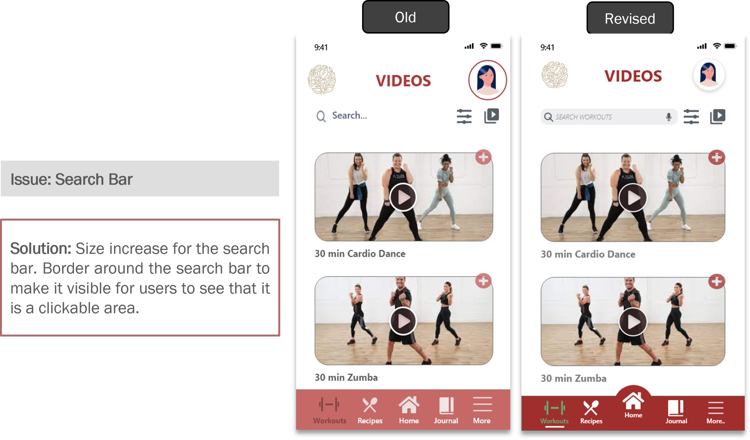
Larger clickable icons
A Library icon where users can save their favorite workouts / view workouts they would like to try in future
Filter feature to help refine results
Asset: Health Journal
V1: Users could upload their medical documents, save preferred doctors and medical appointments
V2: The health journal will primarily focus on helping users track their mood, save appointments and track daily activity
User Testing
Users highlighted that they would like a feature where they can take care of their mental health i.e., daily diary / mood tracker . Users also mentioned that they would like to be & feel rewarded for achieving their goals.
Improvements
New features (Overview of set goals & progress, diary entry, badges earned, mood & activity tracking)
Larger images and icons
NEXT STEPS
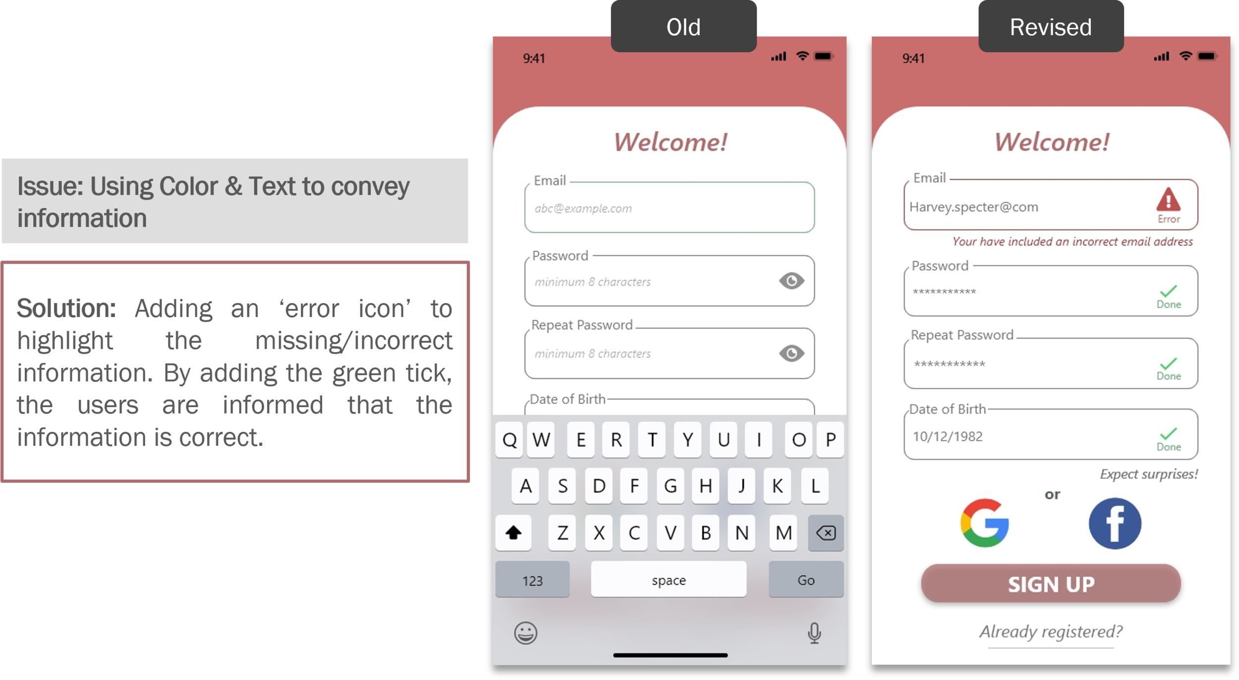
Accessibility
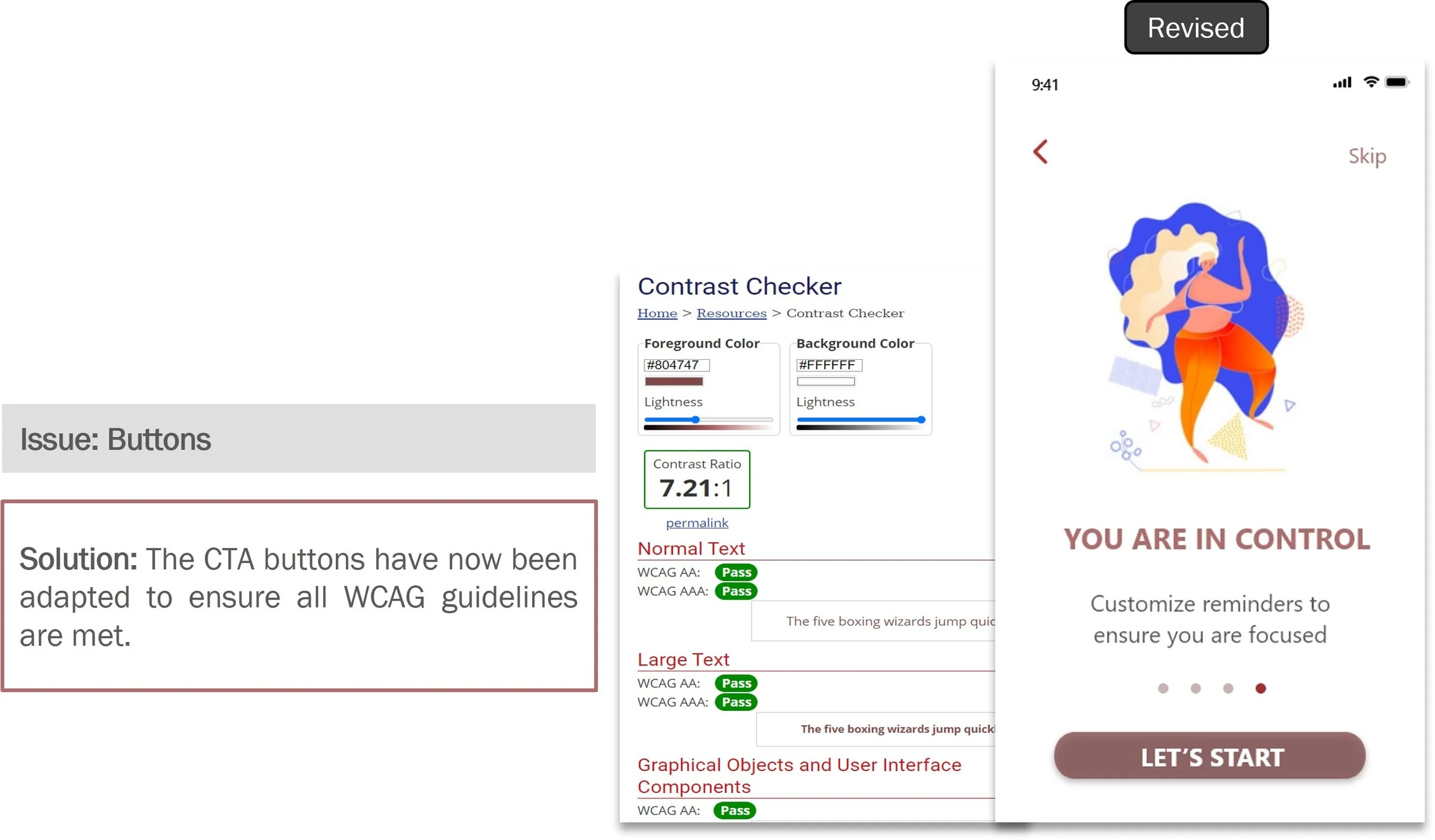
I designed my product with an intention to make it available to users with diverse abilities. Below are some minor adjustments made to the product to make it accessible to potential users.
ENHANCEMENTS
FUTURE TESTING METHODS
As the design is constantly reiterated, the testing methods will differ. E.g., new features will use methods such as Comp Set Analysis & Research, Card Sorting and User Interviews. Whereas for existing features, I would use methods such as preference tests & prototype testing to ensure my user flow is carved out perfectly.
CHALLENGES & LEARNINGS
Kiss Method
Keep it simple, silly! As I progressed in the course, I realized that users are looking for simple solutions to everyday problems. By starting simple and focusing on functionally is more essential. The upgrades and cooler features can always be added as you progress. By offering something complicated right in the beginning, might dissuade users from using the product / might delete it because they find it confusing.
Letting Go
Yes, like many, even I fell in love with my ideas and found it painful to discard some. However, this has been by far my hardest and most successful learning. Because, I can see how much value it adds when you are constantly striving to better the product.
Always Listen
Sometimes what users want is not always what they need. And this learning has been quite enlightening during my interview & usability phase. The art of listening and always questioning the ‘why’ has helped me hone my skills of interviewing people and listening deeply.
Plan structured interviews
As a newbie to conducting interviews, initially I did have some trouble crafting the right questions and keeping a track of time. However, with time, I kept getting better and now I feel very confident talking to users.
Embrace the new
The constant learning & unlearning process for new tools & software in a short period of time was certainly challenging but I am amazed how quickly our mind adapts. This process help me expand my skillset and my sharpened my grey cells too.
CONCLUSION
During the course of the project, I have had my share of challenges & learnings. The thrill of learning something new and expanding my career horizons has been an overall elevating experience.
As this project was very close to me personally, I empathized as a user what I was looking for, from a health & fitness app and used my experience to further explore what other users are looking for. The learnings from my experience and the feedback from participants helped me enhance my skills as a designer to work towards creating a product that will add value to people’s lives.
On the other hand, there are a few things that did not go as expected such as the Medical Journal feature, however this did not dampen my spirit as after piloting some tests, I could identify the areas of improvement. It is now one of my action points to create some high-fidelity screens and conduct some more usability testing. As we and our surroundings evolve, I believe that continually improving the design will help me align better with the users needs & goals.
And lastly, I would like to give myself a tiny pat on the back for keeping an open mind throughout my course, welcoming new ideas & criticism from teachers & colleagues and not losing optimism even though my design still requires tons of improvements to make it functional & visually appealing.


