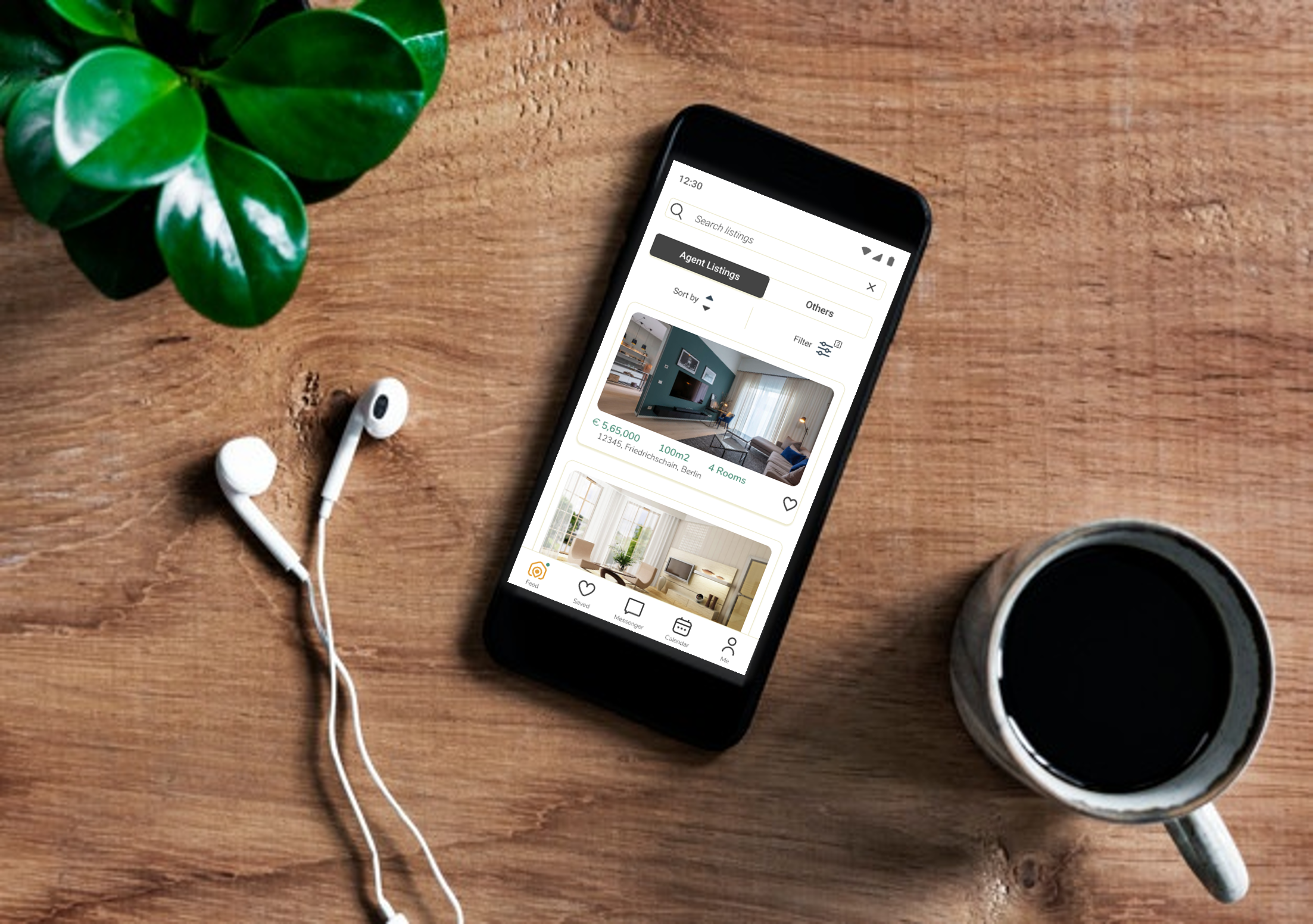
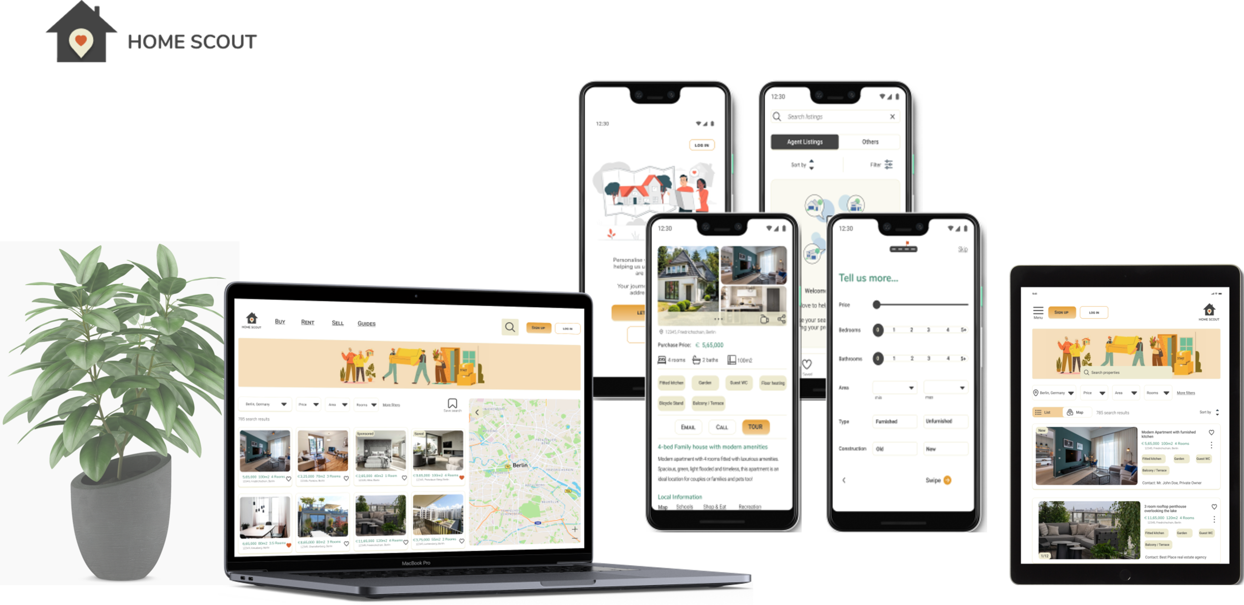
Home Scout is a responsive web app that provides property buyers with information on property investments. As buying property is an intriguing decision financially and emotionally, the app focuses on providing users simplicity and functionality.
“If you haven’t found it yet, keep looking. Don’t settle, As with all matters of the heart, you’ll know when you find it.”
- Steve Jobs
PROJECT OVERVIEW
Role: UI & UX Designer
Duration: August 2021 – November 2021
Tools
Pen & recycled paper
Figma
Google Drawings
Marvel
Balsamiq
Contribution
Competition research
User Flows
Wireframes
Style Guide
UI Elements
High Fidelity Mockups
Content Creation / Copywriting
MY STORY
Onboarding Screen
What motivated me to design a property app?
After living for about 6 years in Germany (Hamburg & Berlin), my partner and I decided to buy an apartment in Berlin (Germany). We always kept pushing our plans to buy an apartment as we apprehensive about the buying process, legal documentation in a foreign language that is not native to us etc.
The process was certainly not smooth sailing and we had our share of ups & downs, but eventually it all worked out in the end. This experience led me to choose to design a property buying app as I was a user once and could identify the issues we faced when we decided to invest in an apartment.
Inspiration behind the project
Many of our friends regularly consulted us when they were considering buying an apartment, this helped me shape my design and features that would be helpful for first time buyers.
A few constant frustrations faced by our friends / users:
Finding the best right bank and interest rates
Translation services & assistance for meetings
First time buyer guides / helpful articles
Finding reputed lawyers (who speak multiple languages)
PERSONA
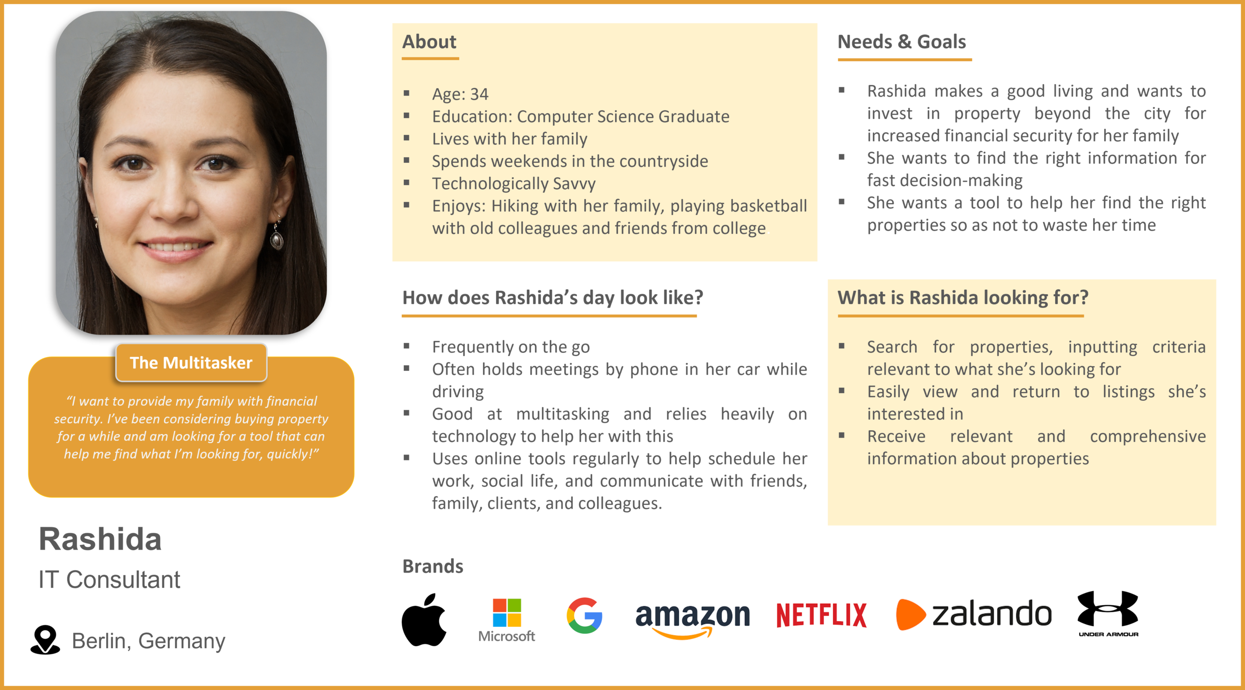
For my project, I created one primary persona to ensure I am designing for my audience without losing sight of their needs & goals. The persona also highlights the situations & environments in which users would use my product.
A persona works as a guiding light that help me design solution that matter most to the users.
IDENTIFYING THE PROBLEM
Based on my learnings from the UX course, I decided to dig deeper into the needs and pain points of my persona. I used the Double Diamond Strategy to craft my problem statement and chalk out potential solutions that could benefit my users.
PROBLEM STATEMENT
Rashida needs a way to access reliable and comprehensive information about property investment without wasting much time because she wants to provide her family with financial security.
We will know this to be true when we see Rashida using Home Scout to seek information about potential properties and making appointments on-the-go for property viewings.
HYPOTHESIS STATEMENT
I /we believe that by offering helpful articles & guides, an online appointment option and a comprehensive filter that presents Rashida with relevant results, we will achieve 20% engagement from our users and gain user trust.
COMPETITIVE RESEARCH
Upon identifying the problem statement, I decided to do conduct a competitive research to understand the visual design adopted, identify design trends, weaknesses and opportunities.
USER STORIES
After identifying the competitive set, I decided to focus on some key user stories that were based on my persona’s needs.
As a user, I want to create a profile containing all my property criteria, so that I am recommended results most relevant to me.
As a user, I want to be able to search and filter properties, so that I can find good matches based on my needs.
As a user, I want to be able to save or mark properties I am interested in, so that I can easily revisit them.
As a user, I want access to as much written and visual information as possible about properties I’m interested in, so that I can make an informed decision.
As a user, I want to be able to contact the right people if I am interested in viewing a property, so that I schedule a viewing.
USER FLOWS
I chalked out three user stories to get some visual clarity on how the user will navigate through my product. I also wanted to aim to simplify the steps taken to reach the end goal.
WIREFRAMES
With a brief amount of information on my persona and the competition analysis, I decided to sketch my initial thoughts on what features could be beneficial for the users. As I was designing a responsive web app, I chose to go with an 8-column grid for mobile.
I wanted to switch from paper sketches and designed my screens using Marvel. I set a time limit for myself to design each screen so I can be prepared to quickly share my ideas with the team especially when I am presented the opportunity to work remotely.
Low Fidelity Wireframes
Mid Fidelity Wireframes
Hi Fidelity Wireframes
HOME SCOUT KEY FEATURES
Engaging Onboarding Process: To understand key requirements thereby showcasing results that are relevant to the user and their specifications.
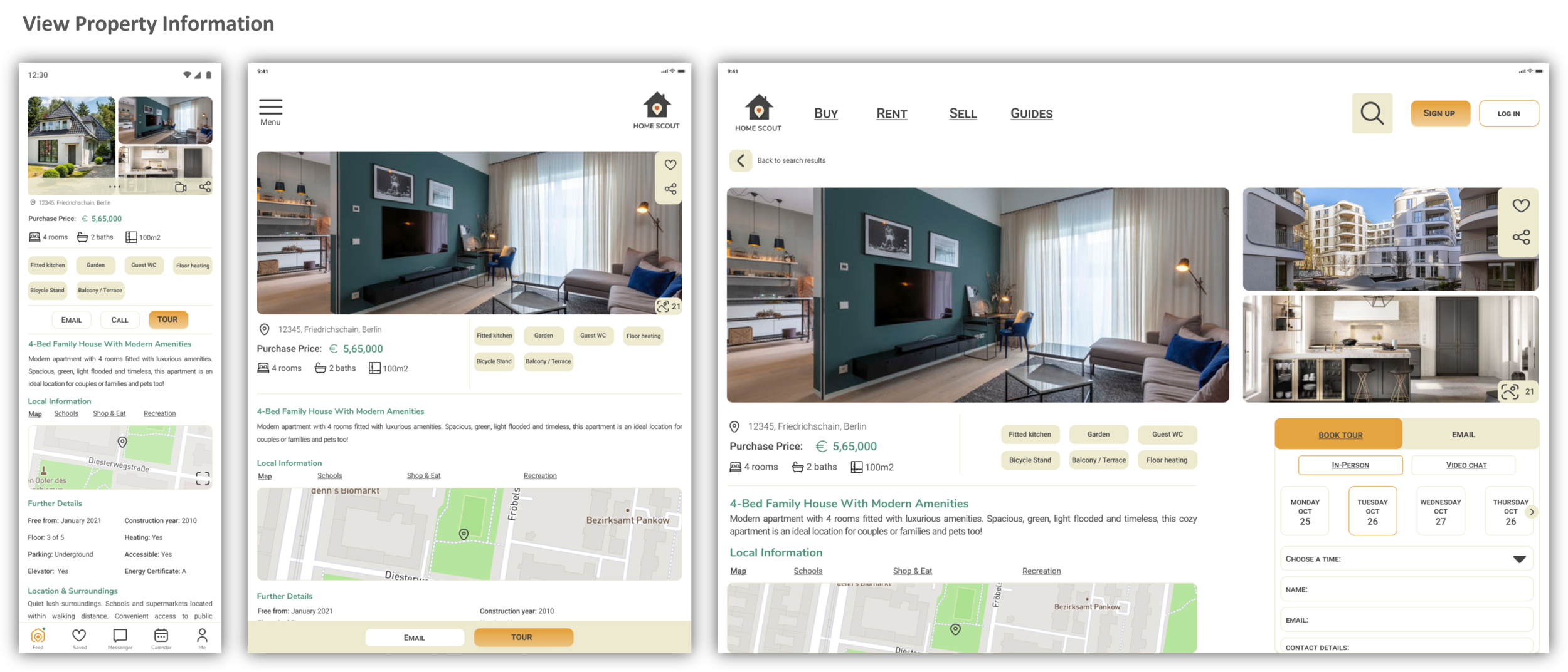
Property Information: Clean design to help users stay focused on the property images. The cards on the home screen will allow users to quickly save/favorite the properties they find interesting. Upon clicking on the interested property, users can view extensive details about the property thereby helping them to make an informed decision. Users also have the option to share the property listing with friends / family.
Users who skipped the onboarding process will be guided to the second screen which informs about the steps that need to be taken to achieve relevant search results.
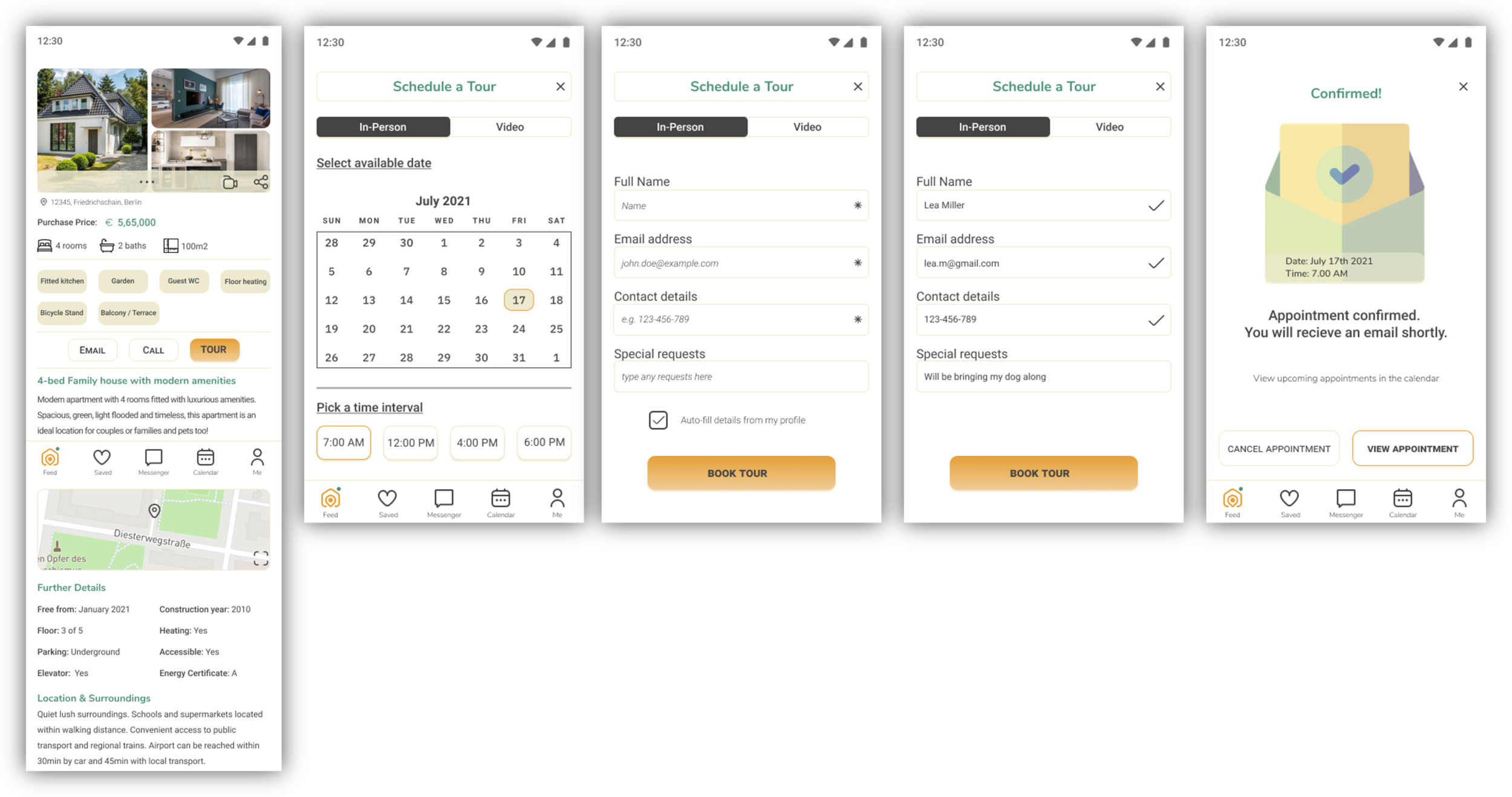
Book A Tour: Once the user has identified a property that they are interested in, they have the option to Email, Call or Tour the property. In this case, the user chooses to book an appointment for an in-person tour. The user can view a calendar to select a date & time that suit them. Upon selection, the user is provided a form to confirm the appointment. The user can also choose to ‘auto-fill details’, thereby reducing the amount of effort taken to fill a form and helping them to make decisions quickly & effectively.
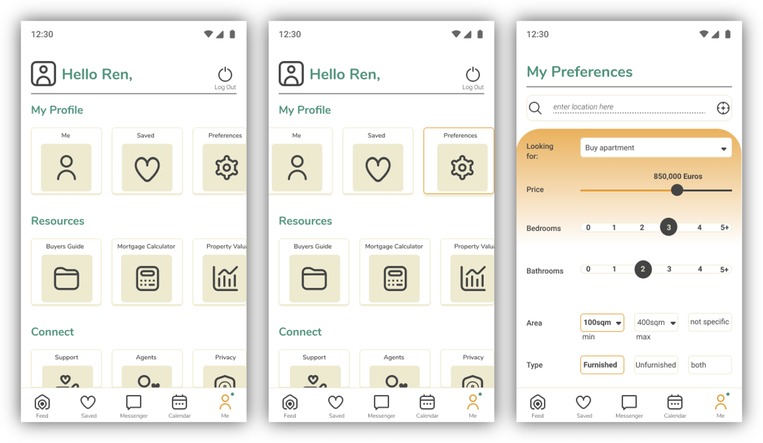
View and Customize Preferences: Users can customize their preferences at any point to ensure their search results are relevant to their needs. The features will also offer users an extensive list where they can select requirements that are most valuable to them. e.g. Schools nearby, parks, airport etc.
STYLE GUIDE
Once I was happy with the outcome for the wireframes based on my research & sketches, I commenced work on creating my Style Guide. The style guide encapsulates key information about my product to ensure brand & visual consistency.
MOODBOARD
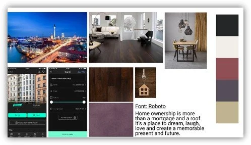
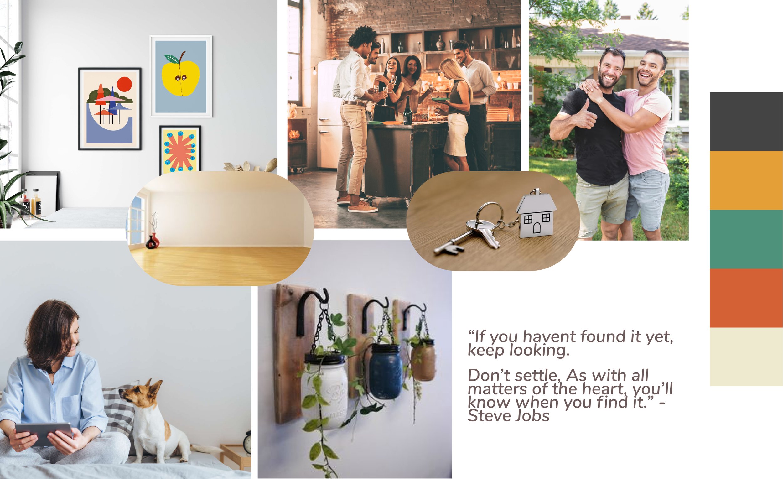
To start off, I decided to create two Moodboard options to establish the appropriate look & feel for the product. The Moodboard served as an inspiration tool when I was forming the visual identity.
The two options showcase a Light and Dark mode, each propagating a unique brand messaging to communicate my vision for the product.
Rationale:
Clean minimalistic design
Warm
White space helps users focus on the property images
Inclusive
My Thoughts:
When you first visit an empty apartment, few things strike out first: White Walls, Wooden flooring, Sunlight, view of a Garden or the Sky from the window.
With that in mind, I chose the Light Mode and my thought process helped me further to form my color palette as well.
IMAGERY/ILLUSTRATIONS
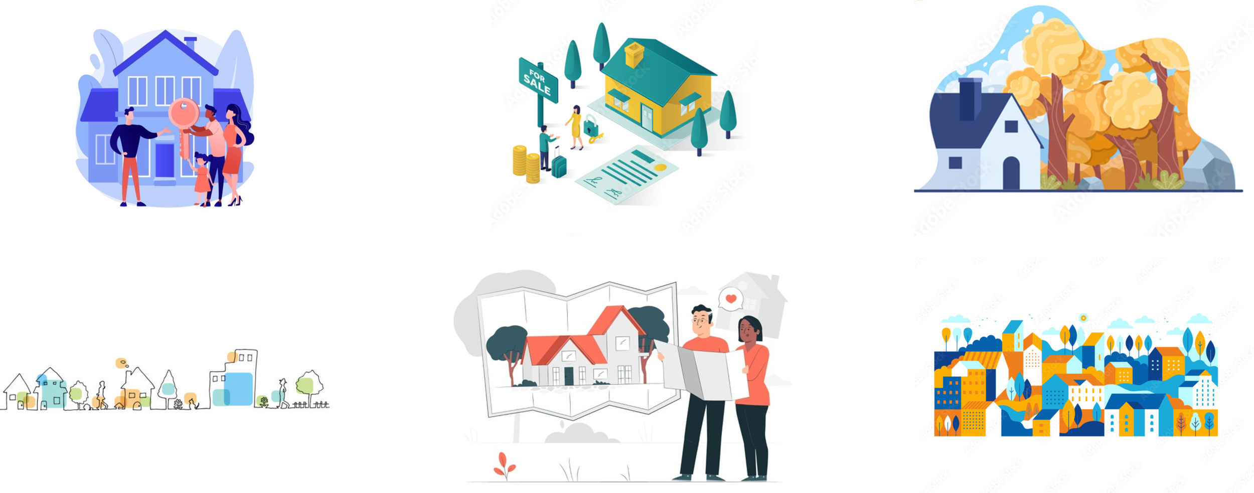
Rationale: I chose Flat illustrations because the app will feature ‘real’ photos of properties and I wanted the users to get a break from the monotony
Flat Illustration is fun and trendy
Easily scalable
Represents diversity
Since property apps can come across as a ‘serious’ product, usage of vectors / flat illustrations helps the user feel calmer and adds an element of freshness and fun
TONE OF VOICE
The content and copy needs to be simple yet effective, as buying a property involves a lot of decision making. The users need to feel secure and informed before they commit to investing. The copy needs to unobtrusive and not push users to make quick decisions rather engage users gradually into the process, so they do not feel overwhelmed.
COLOR PALETTE
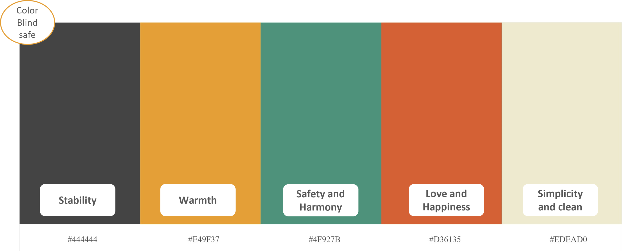
With inspiration from my Moodboard, the color palette was formed. I used Adobe Color to ensure that my selected color palette is color blind safe too.
In the image, I have also highlighted the emotions I aim to evoke within my uses when they are using my product.
FONT
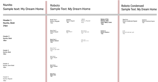
Typography for Home Scout
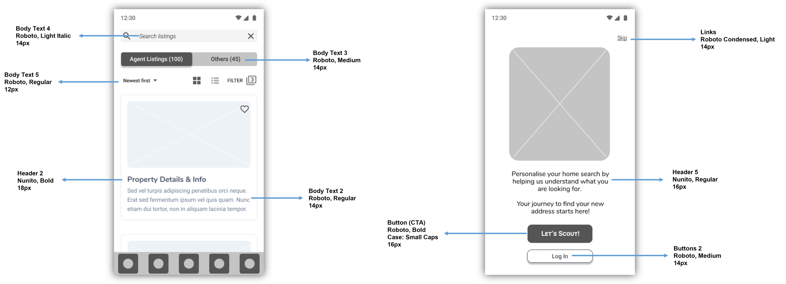
Home Scout uses three typefaces: Nunito, Roboto and Roboto Condensed. The fonts have been kept simple to ensure readability. Below you will a snap snapshot depicting how the fonts will be used throughout the product.
Font Usage in Home Scout
BRAND LOGO
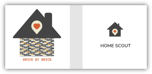
Created two options of the brand logo, after doing some internal A/B Testing, I chose Option 2 for my product as it aligns with design vision and ties in perfectly with the moodboard.
Despite not having a background in graphic design, I was excited to take on the chance to create a logo for the product. It allowed me full liberty to bring to life what I envisioned. It is a simple representation of my idea.
Rationale: Since I went through the tedious process of buying an apartment, I aimed to showcase my emotions when I found the perfect match. Hence the inclusion of the location & heart icon was an undisputed choice. As the saying goes, “Home is where the heart is”.
ANIMATION
I have personally always enjoyed the animations within the products, it certainly enhances user experience immensely.
It was certainly an exciting moment for me to create a simple animation for my splash screen. It was quite interesting to see my modest idea come to life.
When buying an apartment / house, the location and surroundings makes people fall in love with their future homes. Hence I chose to animate the location and heart symbol, as I wanted these aspects to be the focal point.
ICON CREATION
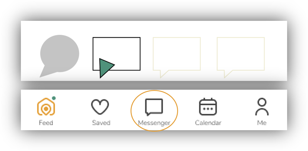
As a greenhorn, I also tried to create a few icons for my product. The deconstruction of icons to create a unified design was quite a fun experience. It reminded me a deconstructed sandwich that I relished at a fancy restaurant in Hamburg, Germany.
For the bottom navigation bar, I created a messenger icon where customers can view/save their conversation history with potential property sellers and track confirmation emails for their appointments.
For the Privacy icon (in the My profile section), I chose to combine two separate icons to create an icon that highlights security and data protection.
UI ELEMENTS
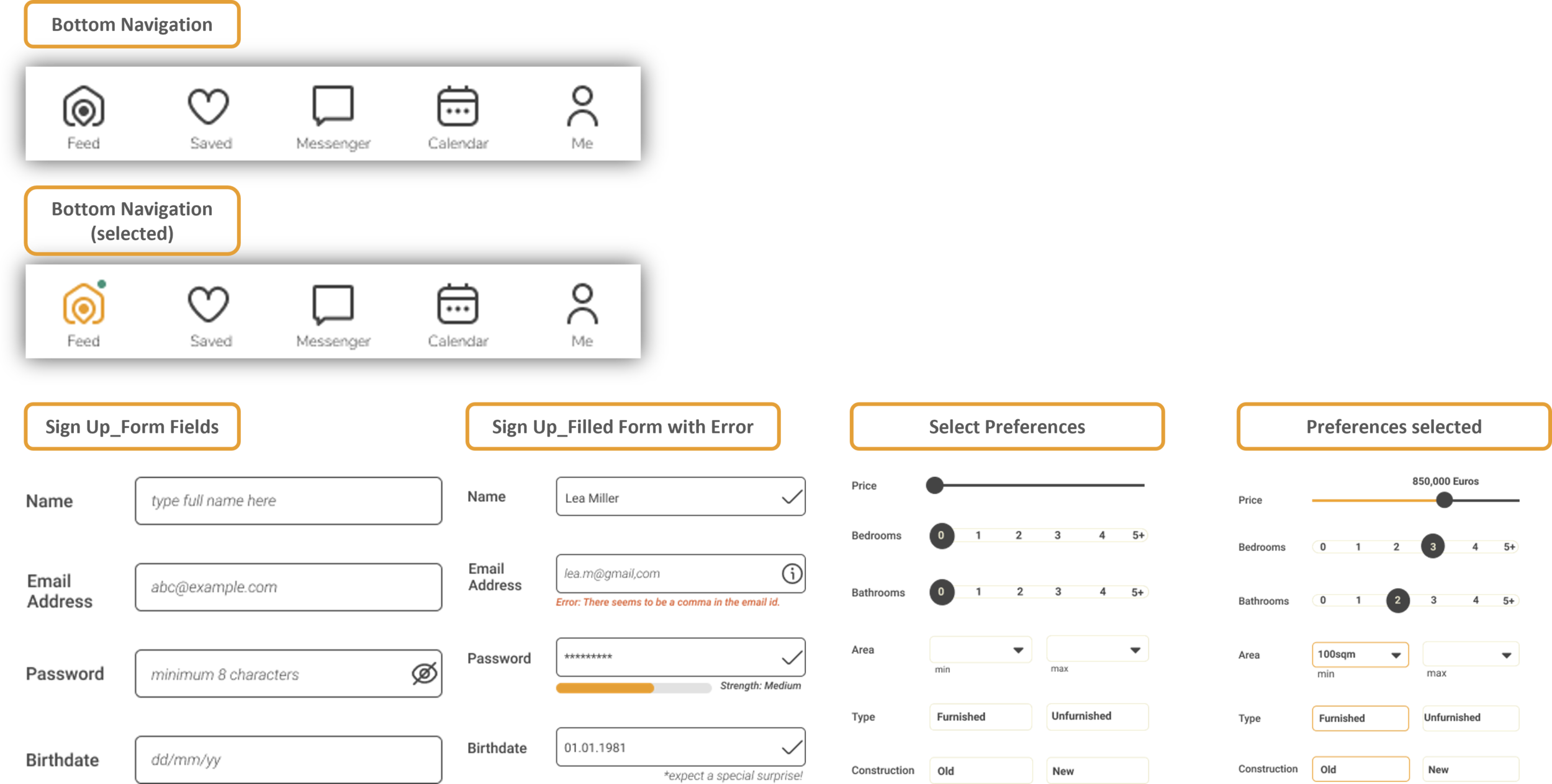
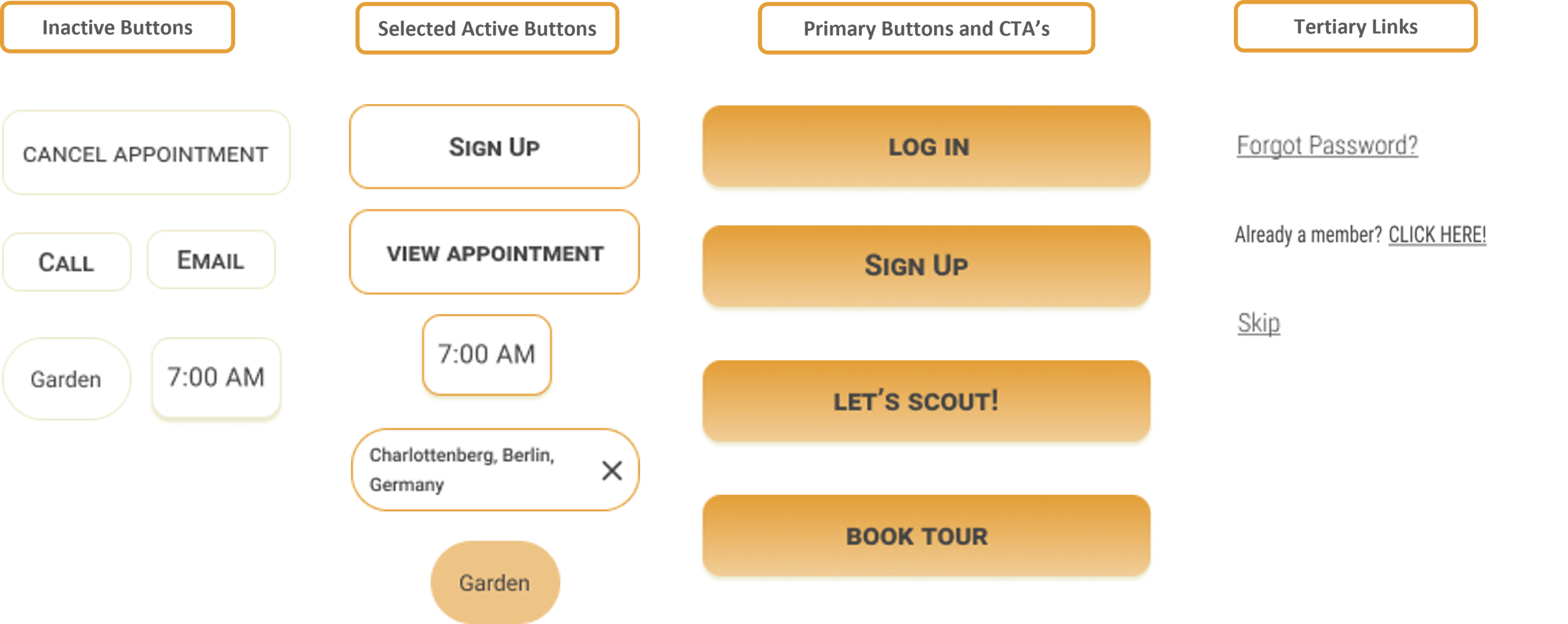
With a strong focus on the visual identity of the product, here is a snapshot of important UI elements within my product. I aimed to create a fun experience for my users, something that is easy to understand, intuitive to use and focuses on functionality & accessibility.
Product Icons with a rounded edge to give it a more fun and modest look.
Bottom Navigation Bar and UI Fields
Buttons
Responsive Design
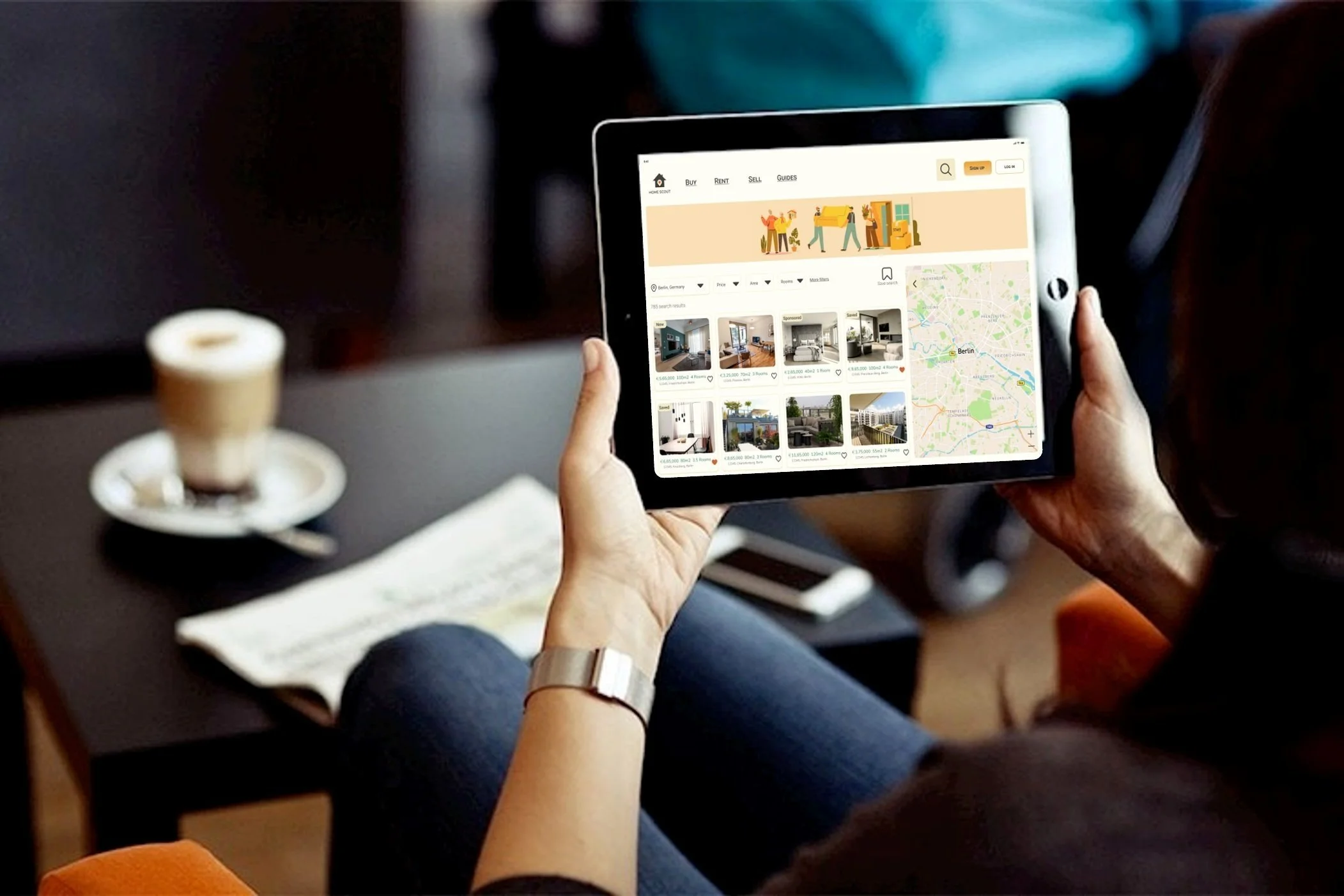
Home Scout has been designed with a mobile-first approach. To ensure users have the best user experience across platforms, I designed screens for the tablet and desktop as well.
By starting with a mobile-first approach, it helped me stay focused on user needs and not clutter the design. With the tablet & desktop, I can start thinking of scaling up the design given the amount of real estate available.
Mobile (W: 360 H:640) Tablet (W: 768 H: 1024) & Desktop (W: 1440 H: 1024)
Low Fidelity Sketches for the Home Screen and detailed property information
Hi-Fidelity Screens for the Home Screen (Mobile - Tablet - Desktop)
Hi-Fidelity Screens_View property information (Mobile - Tablet - Desktop)
DESIGN AT A GLANCE
Design is Iterative & Relentless
With almost a year spent learning new skills related to UX and UI Design, I strongly believe in the ever-evolving nature of design. With the project brief being delivered, I choose to now nurture my creativity and constantly adapt my design with the needs of the users.
FURTHER PRODUCT ENHANCEMENTS
As I continue to refine and reiterate my design, below are few additional features I would like to add:
Language Barriers: Possibility to hire a translator when visiting new houses or apartments
Book Translation services: Translate contracts / letters from the builder / notary
Chat / Forum: For new buyers to discuss their apprehensions & gain or share property or neighborhood related advice
Virtual Meetings / House Viewings: view live broadcasts by the agent
VR or 360 viewings for the apartment or house
Customize your Space (Premium Service): where users can view the empty apartment space and place furniture or objects to get a sense of space and personalize it as per their taste. The users will also be able to download these images. This feature also adds some gamification to the design making it fun & engaging for users.
LEARNINGS
“Whatever it is, the way you tell your story online can make all the difference”.
Seek Inspiration: During my competitive research phase, I felt overwhelmed at the number of features different products offer and I felt the need to populate my product too so that it is ‘the next awesome thing’. However, with my learning from the UX project, I realized that it is okay to start simple and deliver a smooth experience that is focused on functionality & usability. Design is iterative and I will certainly get more opportunities in future to scale my design after some usability testing.
Be Open: Being new to the visual design world, I felt some hindrance in the beginning. However, with time, I got very comfortable with the new online tools to create simple animations, logos or icons.
Listen and make take mental notes: During the project, I realized how important listening is, most of my ideas have been gathered when I was talking to friends during their property buying process. This crucial information has helped me immensely in this project. Having said that, it is important to listen to your friends / colleagues because all these valuable insights might come handy for your next project.
